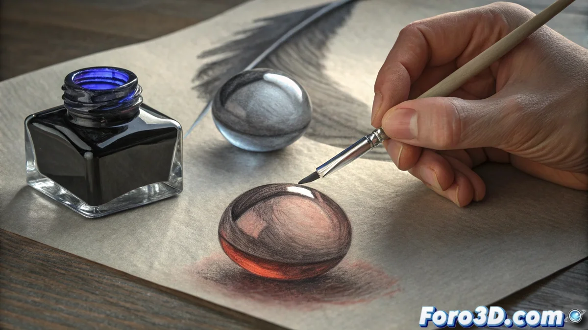
The Technique of Using Two Blacks to Enrich a Grayscale Illustration
When drawing in black and white, you can go beyond a single tone. The key is to use two blacks with different temperatures: one cool and one warm. This approach transforms a monochrome palette, adding a subtle chromatic richness that the eye perceives as more complex and atmospheric. 🎨
Understanding Cool and Warm Blacks
A cool black is achieved by mixing the base black with a touch of blue or violet. Conversely, a warm black is obtained by adding pigments like sepia or an earthy red. This distinction is not about evident color, but about a thermal sensation that influences how we see shadows and light in the composition.
Apply the blacks according to the light source:- Use the cool black for shadows cast by a warm light, such as the sun or an incandescent lamp. This contrast makes the shadow visually separate from the illuminated plane.
- Apply the warm black in shadows generated by a cool light, such as on a cloudy day or the bluish light from a screen. This tonally balances the scene.
An artist discovers that their warm black is actually coffee that spilled in the water a week ago, but decides the accidental sepia tone is perfect.
Integrate the Method into Your Creative Process
You can implement this technique in traditional and digital media without complicating your workflow. The idea is to plan shadows intentionally, always considering the temperature of the main light.
Steps to implement:- In traditional media: Prepare two jars or ink mixes, one for each black. Use different brushes or nibs to maintain tone separation.
- In digital environments: Create two separate layers for shading. Assign a modified black to each and paint using blending modes like Multiply. Adjusting opacity allows you to control the effect's intensity.
- Experiment with transparency and overlaying these layers is key to achieving the desired depth without adding more colors to the palette.
The Final Result
By adopting this technique, your grayscale work gains a new dimension. Shadows cease to be flat and acquire a quality that suggests color and volume more effectively. It's not about adding complexity, but about using simple tools with greater knowledge. Mastering this thermal contrast is a significant step toward creating illustrations that convey a more professional and believable atmosphere. ✨