The Silent Language of Color in Visual Communication
Color transcends its merely decorative function to become an autonomous communication system capable of transmitting emotions and complex concepts without relying on defined shapes or recognizable structures. 🎨
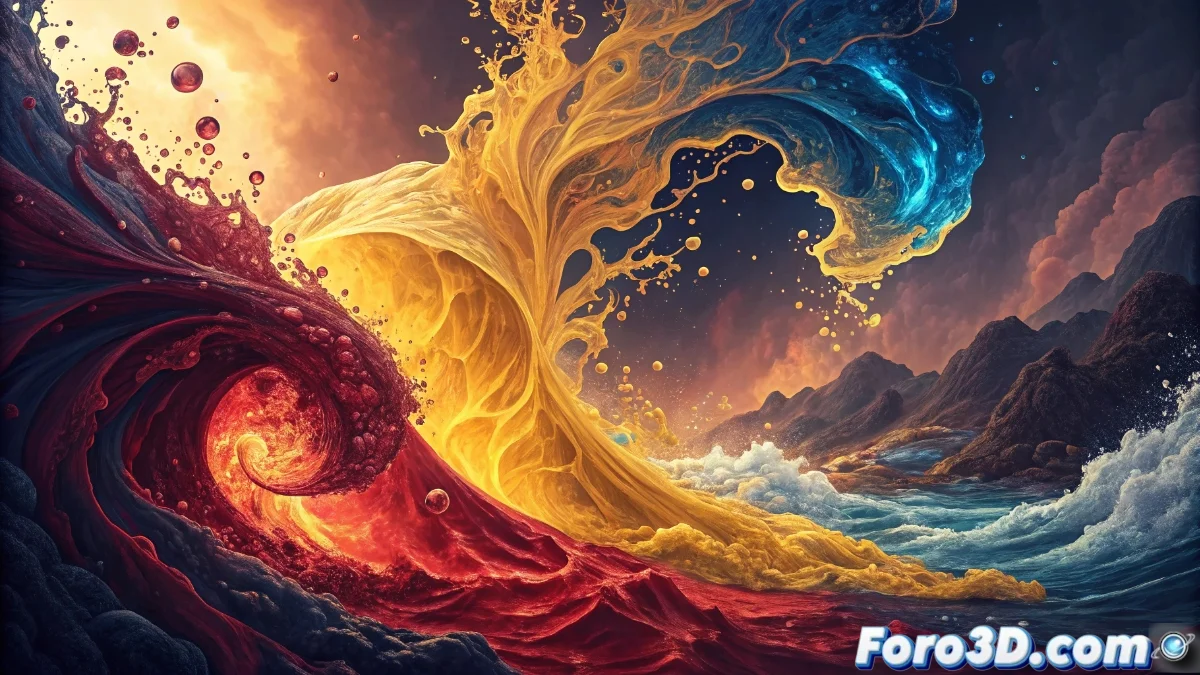
The Emotional Vocabulary of Colors
Chromatic palettes function as a complete visual language where each tone and nuance possesses its own specific semantic and emotional charge. This communication operates at a preconscious level, being processed by our brain in fractions of a second before we can rationally analyze any formal element.
Fundamental characteristics of chromatic language:- Warm colors like reds and oranges convey intense energy, overflowing passion, and a sense of immediate urgency
- Cool tones like blues and greens evoke deep calm, stable trust, and lasting serenity
- This emotional encoding allows building complete visual narratives using exclusively strategically selected color combinations
Color establishes the emotional rules of the visual space before shape can be rationally analyzed
Visual Grammar of Chromatic Harmonies
The construction of meaning through color is manifested in the different chromatic harmonies available. Analogous palettes create smooth and progressive transitions that suggest evolution and continuity, while complementary schemes generate energetic dynamism and vibrant contrast that communicate creative tension or disruptive innovation.
Modulating elements of the chromatic message:- Saturation determines the purity and intensity of the color, where pure tones convey absolute clarity and firm decision
- Brightness modulates the luminosity of the message, with desaturated colors suggesting melancholic nostalgia or deliberate ambiguity
- This visual grammar allows telling complex stories and transmitting brand values without resorting to recognizable symbols
The Temporal Paradox of Chromatic Perception
It is fascinating to observe how we can spend hours debating color combinations while our brain has already processed all the emotional information in the first 0.1 seconds of vision. This temporal paradox demonstrates that, on many occasions, our visual subconscious turns out to be a more effective designer than our rational conscious mind. Color thus confirms itself as the absolute protagonist of immediate and emotional visual communication. ⚡