The Phenomenon of Inverse Horror Vacui in Graphic Design
In the realm of visual design, there exists a little-known counterpart to the traditional horror vacui that equally negatively affects the user experience. We are talking about inverse horror vacui, where the abundance of empty spaces without apparent justification produces a disturbing sense of emptiness and visual bewilderment 🌀.
Psychological Consequences of Excessive Emptiness
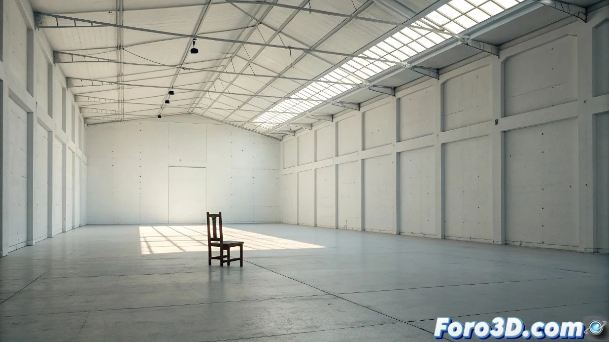
When a composition presents excessively empty areas, users may experience discomfort comparable to being in a vast room with a single tiny object. This visual emptiness not only hinders navigation but also suggests a lack of content or defined purpose, encouraging quick abandonment of the interface. Our brain naturally seeks patterns and meanings, and when it fails to find them in these desolate spaces, it reacts with instinctive rejection.
Common Manifestations of the Problem:- Sensation of an incomplete or partially loaded page
- Difficulty in establishing focal points and visual hierarchy
- Perception of abandonment or lack of professionalism in the design
Extreme minimalism can become its own antithesis when simplicity turns into meaningful emptiness
Strategies to Balance the Composition
To counteract this effect, designers must ensure that every negative space serves a specific function, whether improving readability or directing the gaze toward essential elements. The implementation of strategic white spaces, instead of arbitrary voids, contributes to establishing visual hierarchy and perceptual comfort. The incorporation of subtle elements such as chromatic gradients or faint textures can fill the emptiness without saturating, preserving the balance between minimalism and functionality.
Practical Solution Techniques:- Use of micrographic elements to break spatial monotony
- Implementation of asymmetric grids to distribute visual weight
- Application of low-intensity textured backgrounds to add depth
The Delicate Balance Between Minimalism and Content
While the principle of "less is more" remains valid, when minimalism becomes almost non-existent, users might interpret that the interface is unfinished or that the designer abandoned the project. It is comparable to presenting a banquet plate with a single grain of rice in the center: technically there is content, but the experience is frustrating and paradoxical. The key lies in finding that middle ground where every element, present or absent, significantly contributes to visual communication 🎯.