The Excessive Use of Anamorphic Lens Flare in Digital Design
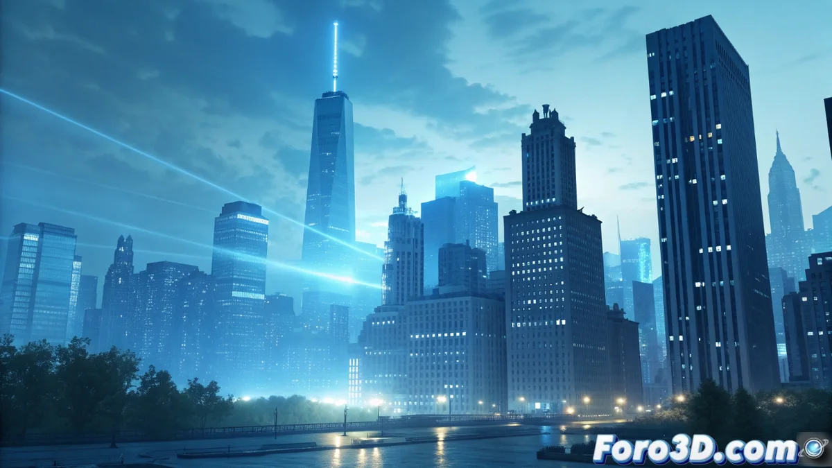
In the realm of digital design, the anamorphic lens flare has become popular for its distinctive blue and elongated streaks. However, its massive implementation without a coherent lighting basis can turn an attractive project into a piece loaded with artificiality and predictable visual clichés. 🎬
The Problem of Visual Saturation
This optical effect, whose origin lies in cinematic lenses, completely loses its narrative and aesthetic purpose when applied indiscriminately. Its unjustified presence not only distracts the viewer's attention but also erodes the authenticity of the composition, prioritizing a superficial style over the central message of the work.
Consequences of misuse:- Loss of credibility: The scene or illustration ceases to be perceived as a coherent whole.
- Distraction from the main focus: The blue streaks compete for attention, detracting importance from the subject.
- Generic aesthetics: The work adopts a pre-fabricated look, similar to low-cost templates.
A lens flare should serve the visual story, not become the story itself.
Principles for Effective Application
To avoid these mistakes, it is crucial to adopt a responsible and contextual approach. The effect should be reserved for situations where there is a diegetic and believable light source that justifies it, integrating the flare as one more element within a balanced composition.
Guide to best practices:- Lighting justification: Use the effect only with identifiable light sources, such as an intense sun, vehicle headlights, or powerful reflections on surfaces.
- Integration with the environment: Combine the streaks with other atmospheric elements like dust, smoke, or rain to increase realism.
- Intensity control: Adjust the opacity, color, and length of the flares so they blend into the scene, not dominate it.
Conclusion: Beyond the Decorative Effect
The anamorphic lens flare is a powerful tool when used with intention. Its value lies in its ability to reinforce the visual narrative and the sense of realism, not in acting as a mere ornament. The next time you consider adding it, ask yourself if it enriches the scene or just screams "look how modern I am." The difference defines professional work from amateur. ✨