When Design Reaches the Category of Art
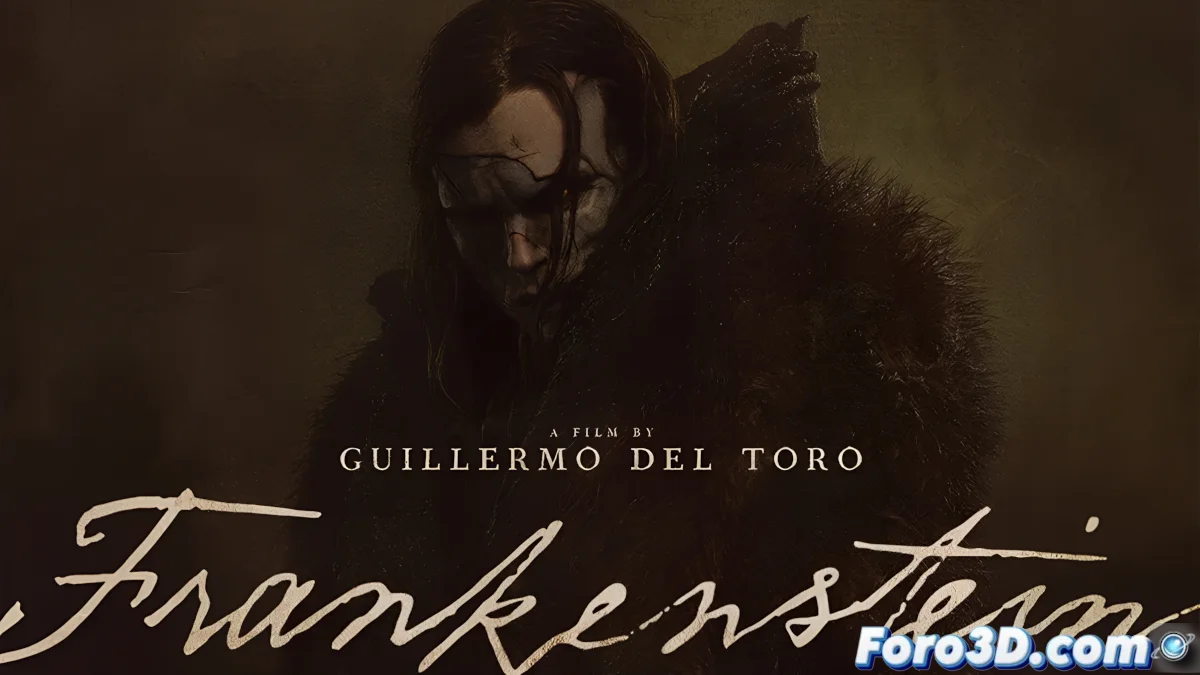
The new Frankenstein poster has achieved what few pieces of cinematic marketing accomplish: being unanimously acclaimed as a perfect work. In an era where poster design often falls into visual clichés or digital excesses, this piece emerges as a beacon of excellence that honors tradition while breathing modernity. The graphic design community has collectively raised its eyebrows, recognizing in this creation that elusive balance between immediate impact and artistic depth.
What makes this poster exceptional is its ability to communicate decades of cinematic legacy at a single glance. The recognizable silhouette of the monster, the typography that evokes vintage cinema posters, and the color palette that balances drama and elegance work in perfect symphony. Each element seems to have been placed with millimeter precision, creating a composition where nothing is superfluous and nothing is missing, demonstrating that well-executed minimalism can be more powerful than the most elaborate effects.
Elements That Define Its Perfection
- Balanced composition that naturally guides the gaze
- Typography that pays homage to the golden age of cinema
- Dramatic lighting that sculpts the monster's features
- Reduced but extremely effective color palette
The Art of Respecting the Visual Legacy
This poster demonstrates a deep understanding of classic horror psychology. Unlike modern approaches that prioritize shock over substance, this piece builds tension through suggestion rather than explicitness. The monster's expression, barely illuminated, allows the viewer's imagination to complete the details, recreating that cinematic magic that contemporary productions often forget in their pursuit of hyper-detailed realism.
This poster demonstrates that true horror lies in elegance, not in grotesqueness
The choice of timeless visual elements over passing trends positions this work to age gracefully. While other posters quickly become dated by ephemeral fashions, this piece seems destined to become an instant classic. Veteran designers immediately recognize the homage to the great poster artists of the 20th century, while new generations appreciate its contemporary freshness, creating a bridge between eras that few marketing works achieve.
Lessons for Graphic Designers
- The power of well-utilized negative space
- The effectiveness of a restricted color palette
- The importance of clear visual hierarchy
- The value of respect for the original source
The universally positive reception of this poster serves as a powerful reminder to the design industry: the audience recognizes and values authenticity and artistic care. In a market saturated with generic solutions and committee designs, this piece stands out precisely because it seems to emerge from a coherent and respectful artistic vision. Its success could influence future cinematic marketing campaigns, demonstrating that sometimes the most effective path is also the most artistic. 🎨
And so, amid so much contemporary visual overload, a Frankenstein poster comes to remind us that the most terrifying monster is, ironically, unattainable perfection in design. 👹