The delicate balance between humor and aesthetics in graphic design
In the current landscape of graphic design, we observe a growing trend toward conceptual hyperbole that seeks to generate intense reactions through approaches to absurdity. This strategy, although potentially effective, presents significant risks when implemented without considering the fundamental visual harmony that every professional design requires. 😅
The paradox of exaggerated humor
Unrestrained exaggeration in humorous graphic elements frequently generates discomfort in the viewer, especially when there is an evident disconnection between the comic intent and aesthetic coherence. Designers must remember that humor works as a complement, not as a substitute for the fundamental principles of design. When funny elements appear forced or disruptive, the central message dilutes and the user experience suffers considerably.
Consequences of the humor-aesthetics imbalance:- Distraction from the main message and loss of communicative effectiveness
- Perception of lack of professionalism and reduced credibility
- Unpleasant visual experience that generates immediate rejection
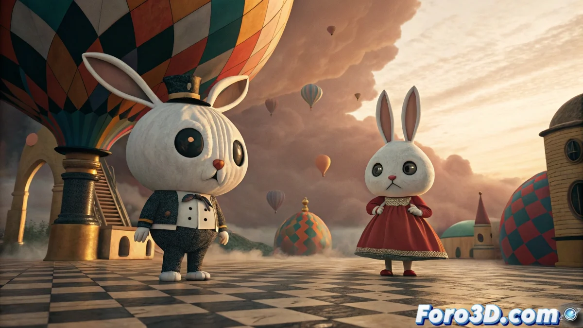
"Humor in design should be like salt in food: enough to enhance the flavor, but not so much that it dominates the dish" - Fundamental principle of balanced design
Strategies for harmonious integration
Achieving the ideal middle ground requires a conscious selection of elements that mutually reinforce the humorous aspect and aesthetic quality. The color palette, typography, and geometric shapes must work together to create a coherent visual narrative where humor emerges naturally without sacrificing legibility or appeal.
Key elements for balance:- Selection of vibrant colors but dosed to avoid visual saturation
- Typographies that complement the tone without compromising fluid reading
- Spatial composition that guides attention without distracting elements
Impact on brand perception
In commercial and corporate contexts, the consequences of poorly implemented humor can be particularly severe. Viewers develop negative associations with brands whose designs they perceive as immature or unserious, directly affecting consumer trust and institutional image. Evaluation of the target audience and application context become critical factors before adopting humorous approaches.
Final reflections on creative moderation
Effective graphic design always requires a conscious balance between innovation and established principles. While humor can be a powerful ally for creating emotional connections, its implementation must arise organically from the overall visual coherence. Designers who master this balance create pieces that are simultaneously memorable, professional, and genuinely fun, demonstrating that in the world of design, as in life, virtue lies in the middle ground. ✨