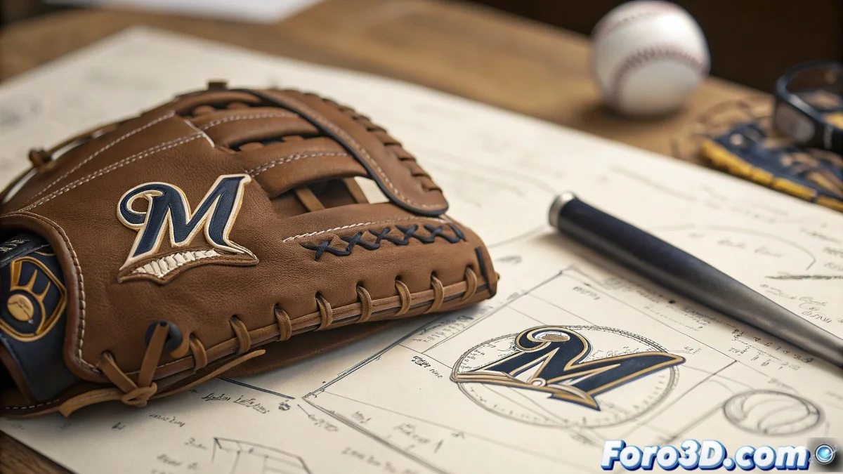
The Milwaukee Brewers Logo That Fooled Everyone for Decades
In the world of design, sometimes the best ideas are the ones hidden in plain sight. The Milwaukee Brewers logo is the master of graphic camouflage, depicting a baseball glove that for years concealed a secret that would make any designer cry with emotion 🎨. What appears to be a simple sports drawing is actually a masterful exercise in minimalist design with a hidden message.
When a Glove is Not Just a Glove
The logo created in 1978 by Tom Meindel demonstrates that genius often lies in:
- Intelligent Simplicity: basic shapes with a double reading
- Hidden Meaning: the initials MB perfectly integrated
- Timelessness: a design that still surprises 45 years later
"The best design is like an inside joke: not everyone gets it at first, but whoever discovers it never forgets it"
Lessons for Digital Artists
For 3D creators and graphic designers, this logo offers valuable lessons:
- The importance of multi-level design that works at different scales
- How to apply principles of intelligent topology in 3D modeling
- The power of revealing details in animation and VFX
Imagine creating a model in Blender where the overall silhouette forms a secret message, or textures in Substance that reveal hidden patterns when zoomed in 🕵️. This approach can elevate any project from ordinary to memorable.
A Secret That Lasted Longer Than Many Marriages
The most curious thing is that the visual trick went unnoticed for years, until a television program revealed it to the world. This shows that even in the age of memes and visual overstimulation, well-executed subtleties can maintain their magic.
Perhaps the next time you design a logo, you should hide a secret message. Just don't expect it to be discovered as quickly as a topology error in ZBrush. After all, if a simple baseball glove could fool millions for decades, what could you achieve with a bit of creativity and an 8K render? ✨