The Art of Negative Space in Horror Poster Design
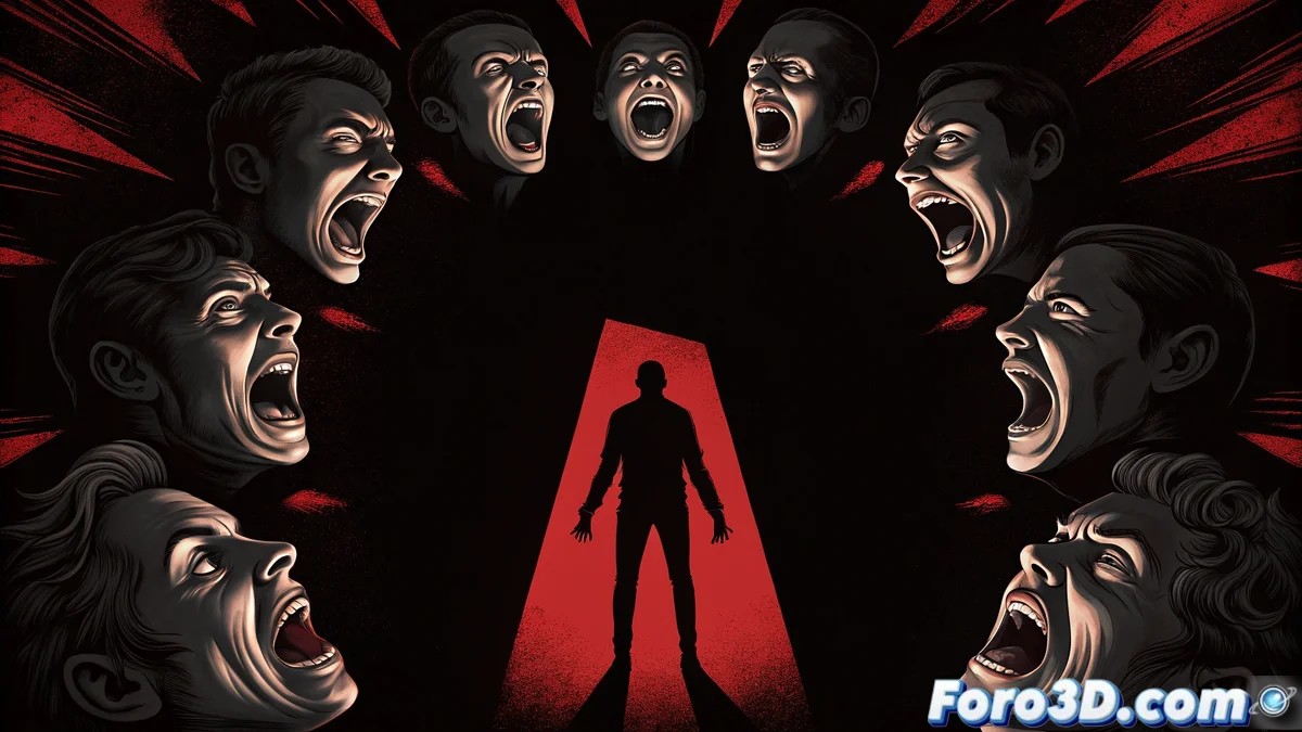
The recent poster for The Conjuring: Last Rites has caused a stir due to its exceptional use of negative space, demonstrating that sometimes what is not seen is more terrifying than the obvious 🎭. The composition shows a group of horrified faces that, when strategically arranged, form the sinister silhouette of a demon. This visual technique stands out not only for its ingenuity but also for how it generates unease through suggestion rather than direct exposure. It is a perfect reminder that in horror, the viewer's imagination is the designer's best ally.
True terror lies not in what you show, but in what you force to imagine.
The Power of the Invisible
In graphic design, negative space is never a purposeless void, but an element loaded with meaning and intention. In this poster, the demonic figure emerges precisely from what is missing, creating a visual tension that is deeply disturbing. This calculated absence activates the observer's mind, forcing them to fill in the gaps and actively participate in the creation of fear. It is a masterclass in how the invisible can have more impact than the explicit, especially in genres where suspense is crucial. 👁️
Practical Applications in 3D
Taking this technique into the three-dimensional world requires creative approaches with software like Blender or Cinema 4D. You can use clipping masks to reveal shapes through voids, employ negative boolean operations to sculpt through subtraction, or generate silhouettes through hidden geometry. A particularly effective technique is the strategic use of projected lights and shadows, where a shadow can suggest a form that does not exist in the geometric mesh. These methods are ideal for creating posters, cinematics, or scenes that play with psychological horror and the suggested. 💻
Creating Visual Tension in Your Projects
The success of visual horror lies in the balance between revelation and concealment. Showing too much kills the mystery, while showing too little can be confusing. Perfect negative space creates that golden tension where the mind completes the alarming. In 3D renders, you can leverage this dynamic by playing with the relationship between full and empty, light and darkness, form and absence. Mastering this contrast can transform an ordinary scene into something deeply unsettling and memorable.
While professional poster designers play with emptiness like virtuosos, the rest of us mortals continue struggling to make our blacks not look like render bugs… because there's a thin line between atmospheric terror and software error. 😉