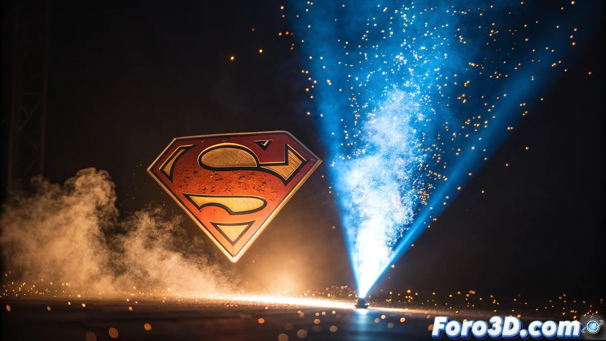
A Modern Tribute to the 1978 Superman
The creative studio Sarofsky has had the honor of designing the main title sequence for the new Superman movie 🦸, the first from the revamped DC Studios. Their proposal rescues the essence of the iconic 1978 original title by the Greenberg Brothers, but reinterprets it through a fascinating interaction of dynamic typography and volumetric light effects. The most surprising thing is that they achieved these effects with analog techniques and practical materials like glass and smoke, fusing the traditional with the digital.
An Emotional Entry to the New DCU
This title serves as an emotional gateway to the new era of the DC cinematic universe. The design intelligently connects with old-school fans while attracting new viewers. The color palette undertakes a fascinating chromatic journey:
- Starts with cool blues and greens
- Transitions to warm tones inspired by the sun
- Shifts subtly to represent other characters in the universe
- Always keeps the focus on the Man of Steel
The sun symbolizes Superman's power, creating a constant visual metaphor 🌞.
Technique and Heart Behind the Design
Erin Sarofsky, president and executive creative director of the studio, explains that their approach was to show Superman as a ray of hope and humanity. The sequence honors 50 years of visual legacy while presenting a modern vision of the character's heritage under James Gunn's direction. The balance between tradition and innovation is perfect, demonstrating that analog and digital can coexist harmoniously.
The approach was to show Superman as a ray of hope and humanity, honoring 50 years of visual legacy
Recognition from the Direction
James Gunn, director and co-CEO of DC Studios, publicly praised Sarofsky's work for its boldness, passion, and technical precision. He highlighted the studio's talent for reinventing Superman's visual legacy and adapting it to a contemporary narrative within the new DCU. This recognition is no small thing, considering the meticulous care Gunn puts into every aspect of his productions.
Beyond the Screen
The sequence not only serves as the movie's opening but also reinforces the visual identity in promotional materials like trailers, posters, and key art. This extension of the design beyond the screen demonstrates the comprehensive impact that a good title sequence can have on an entire cinematic production's marketing campaign.
In the meantime, fans speculate whether these titles will be as memorable as the originals... and whether they'll need sunglasses to watch the movie in theaters 😎.