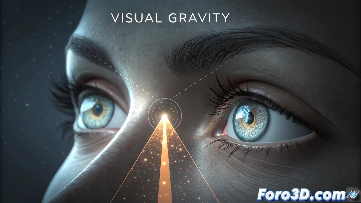
Reading Gravity: The Invisible Flow That Guides the Gaze
In the realm of visual design, there is a principle that governs how we perceive an image: reading gravity. It refers to the natural path that our eyes follow when scanning a composition. In most Western cultures, this pattern starts in the upper left and moves to the right and down, although it is not an immutable law. Expert designers learn to manipulate this flow to direct the viewer's attention to the most relevant elements, establishing a clear and powerful hierarchy. 🧭
Mastering the Visual Path to Communicate Better
Understanding how the gaze moves allows for organizing information in a logical and predictable way. This is not about imposing a rule, but about using knowledge of eye behavior so that the message is transmitted without noise. When a design is structured with this principle in mind, the viewer perceives the content in the desired order, making the experience intuitive and reducing confusion. Ignoring this gravity can make a visual piece seem disorganized and difficult to decipher.
Key Techniques to Direct Attention:- Contrast and Alignment: Using marked differences in size, color, or shape, along with careful alignment, creates anchor points that attract the gaze immediately.
- Negative Space and Implicit Lines: The empty area around an element (negative space) and the lines suggested by the composition act as invisible paths that guide the eye from one point to another.
- Strategic Placement: Positioning a crucial component in the areas where the gaze usually begins or ends its path gives it a dominant visual weight.
It is the art of making the viewer's eyes follow an invisible choreography, a guided dance that, when it works, seems the most natural thing in the world.
Practical Applications in Visual Media
This concept goes beyond theory and is fundamental in very concrete applications. From user interface (UI) design and web pages to the creation of posters, magazines, or advertisements, thinking about how it is read optimizes communication. The ultimate goal is to reduce cognitive load for the observer, presenting information clearly and making the main message stand out effortlessly.
Areas Where Applying This Principle Is Crucial:- Web Design and UI/UX: To organize menus, action buttons, and content, ensuring intuitive navigation.
- Editorial Design: In the layout of magazines, books, and newspapers, to establish a clear reading order.
- Advertising and Poster Design: To ensure that the key message and call to action are captured in seconds.
The Essence of Effective Visual Communication
Essentially, working with reading gravity is understanding and respecting how we see. It does not force the gaze; it invites it on an organized journey through the information. A designer who masters this flow can create compositions that are not only aesthetically pleasing but above all communicate precisely and efficiently. It is the difference between a design that is only looked at and one that is truly read and understood. ✨