Visual Rejection Psychology in Food Graphic Design
In the field of graphic design specialized in food, there are visual elements that can provoke an immediate rejection in consumers. The representation of food products with artificial textures, unnatural colors, or greasy appearances activates deep psychological mechanisms that directly affect brand perception 🍽️.
Psychological Mechanisms of Visual Aversion
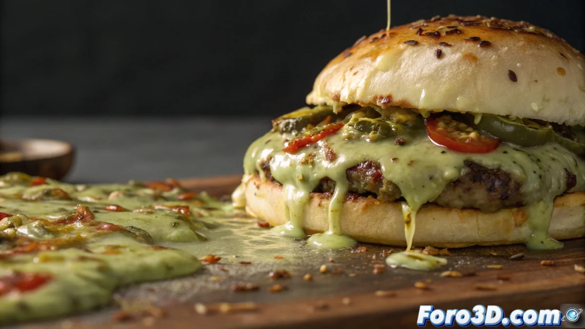
Our brain processes food images through evolutionary patterns that associate certain characteristics with danger or spoilage. When a design presents excessive oily shines, unnatural greenish tones, or textures that suggest mold, what specialists call the adaptive disgust response is activated. This instinctive reaction can lead the viewer to reject not only the specific image but the entire linked visual identity.
Triggering Factors of Rejection:- Excess visible fat and artificially exaggerated reflections
- Pale chromatic palettes or unnatural brown tones
- Textures that suggest decomposition or lack of freshness
The human brain processes food images with special sensitivity, inheriting survival mechanisms that associate certain visual characteristics with spoiled food
Strategies for Graphic Designers
Professionals can neutralize these effects through conscious decisions in color selection and surface treatment. The choice of vibrant but natural tones, meticulous control of reflections to avoid oily appearances, and the use of high-quality photographic references constitute fundamental tools.
Visual Optimization Techniques:- Selection of natural and vibrant chromatic palettes
- Precise control of reflections and shines in representations
- Advanced adjustment of parameters in 3D shaders and materials
The Paradox of Digital Perfection
It is particularly interesting to observe how we can spend hours of work perfecting the sub-surface scattering of a rendered donut while our real food cools on the desk, demonstrating that sometimes digital simulation can be more satisfying than tangible reality. This paradox underscores the crucial importance of controlled realism in contemporary food graphic design 🎨.