When Urban Design Affects Mental Health
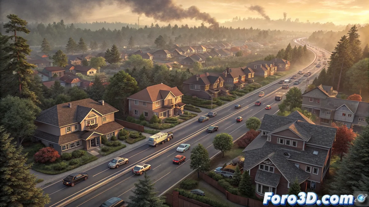
A monumental study that followed 6.6 million people over a decade reveals that living near major roads significantly increases the risk of dementia. 🚗🏙️ In Rhinoceros, we can visualize these findings by creating models that show how proximity to high-traffic roads—and their associated pollutants—correlates with impacts on brain health. This spatial representation helps communicate invisible but critical risks of contemporary urban design.
Initial Model Setup
Upon opening Rhinoceros, the file is configured with units in meters for precision in critical distances (50m vs 300m). Layer organization is essential: Main_Roads, Zone_50m, Zone_300m, Buildings, and Pollutants keep the model organized. Saving as dementia_risk_traffic.3dm preserves this structure… because in spatial analysis, organizational clarity reflects conceptual clarity.
Urban Environment Creation
Main roads are modeled as extruded surfaces with NURBS curves, assigning dark materials to represent asphalt. 🛣️ Risk zones are outlined using offset curves from the edge of the roads, creating concentric rings at 50m and 300m distances. Residential buildings are placed as simple volumes inside and outside these zones, with greater density near the roads—simulating typical urban development.
Visualizing health data in 3D environments transforms abstract statistics into comprehensible spatial relationships, allowing urban planners and citizens to visualize the everyday impacts of planning decisions.
Representation of Pollutants and Risk
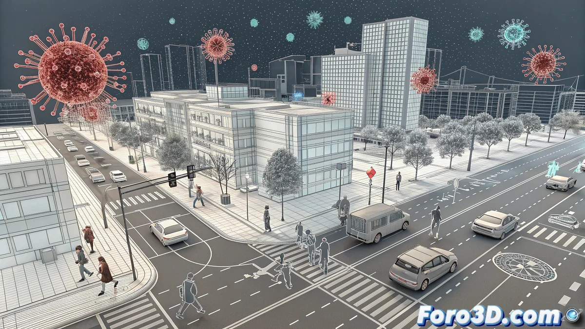
Pollutants—nitrogen dioxide and fine particles—are symbolized by point clouds or transparent surfaces colored in reddish and gray tones. 🌫️ These shapes are concentrated near the roads and disperse gradually, using transparency gradients to show concentration decrease. Abstract human figures (cylinders or spheres) are distributed differentially, with greater density in the high-risk zone to emphasize the 7% increase in dementia finding.
Visualization and Analysis Techniques
- Strategic Views: Aerial cameras are set up to show the global relationship between roads and buildings, and street-level views that illustrate real proximity.
- Technical Rendering: Technical visualization mode or wireframe is used to maintain analytical clarity, with differentiated colors for each risk zone.
- Sectional Cuts: Cutting planes are created that reveal the spatial distribution of the population in relation to pollution sources.
Rendering and Presentation of Results
High-resolution images are exported that highlight critical zones, using alert colors (reds/oranges) for higher-risk areas and greens/blues for safe zones. 📊 Optionally, virtual walkthrough animations are generated that show the experience of living at different distances from the roads. These visualizations serve as powerful tools for advocacy in public health policies and urban planning.
Beyond Visualization
This model not only illustrates a study; it offers a template for evaluating future urban projects through the lens of public health. 🏗️ Rhinoceros's ability to quantify distances and volumes makes it ideal for predicting the impacts of new road infrastructures on adjacent communities.
Thus, while real traffic continues to emit invisible pollutants, 3D modeling makes them visible and measurable… without the need for sensors or years of monitoring. Because in Rhinoceros, the only toxic fog allowed is that of creativity. 😉