Master Manual White Balance for Creative Mobile Photography
Going beyond your camera's automatic mode is the first step toward purposeful photography. Manual white balance is that hidden lever in Pro mode that transforms your device from a simple capturer into a brush of chromatic emotions. Instead of letting the sensor decide for you, you take absolute control over the visual atmosphere you want to convey, defining whether a scene should breathe warmth or project coldness. 🎨
From Technical Correction to Artistic Expression
While automatic white balance seeks to neutralize colors, the manual version is a tool for visual storytelling. By adjusting Kelvin values, you're not correcting an error, but painting with light. Low values, close to 3000K, bathe the image in amber and golden tones, evoking intimacy, nostalgia, or the comfort of an interior lit by bulbs. Conversely, sliding toward 7000K or higher floods the composition with blues and cyans, suggesting melancholy, technological coldness, or the serene clarity of a cloudy day. The difference between a "correct" photo and a "meaningful" one lies in this control.
Key scenarios for applying creative adjustments:- Portraits at sunset: A slight increase in warmth (5500K-6500K) can intensify the golden hour's glow, adding drama and emotion to the subject.
- Architecture and urban landscapes: A bluish tint (7000K+) can accentuate clean lines, create a futuristic feel, or highlight the texture of concrete and glass on gray days.
- Product photography and still lifes: Adjusting the temperature to match the object's emotionality (warm for food, cool for electronics) subliminally directs the viewer's perception.
Manual white balance is not about seeing the world as it is, but showing it as you feel it.
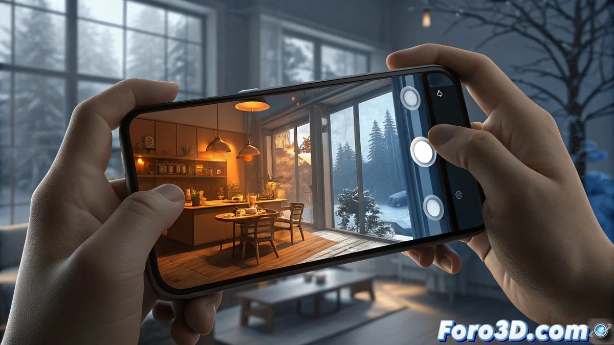
Practical Guide for Manual Adjustment on Your Mobile
To get started, open your smartphone's camera app and activate Pro or Manual mode. Look for the icon labeled "WB" or "White Balance." There you'll usually find a slider or the option to enter a numerical Kelvin value. The beauty of this process is the real-time feedback: you'll see the screen change tone instantly.
Recommended workflow:- Observe the dominant light: Identify if the scene is lit by sun, shade, LED bulbs, or fluorescent light. This gives you a starting point.
- Experiment without fear: Slide the control to both extremes to see the full range of possibilities. Sometimes, the most artistic adjustment is the least "natural."
- Shoot in RAW format: This is the golden tip. The RAW file preserves all the color information captured by the sensor, allowing you to readjust the color temperature in post-production without any degradation, giving you studio flexibility in your pocket.
The Balance Between Power and Good Taste
With this creative power comes the responsibility of conscious moderation. An excess of orange tones can make a cup of coffee look like artificial broth, while an abuse of blues can turn a cheerful portrait into a cold and unnatural scene. The key is to use the adjustment to enhance the story the image already tells, not to mask it. Start with subtle adjustments and, as you gain confidence, explore bolder styles. Ultimately, mastering manual white balance is signing your photographs with your own emotional palette. ✨