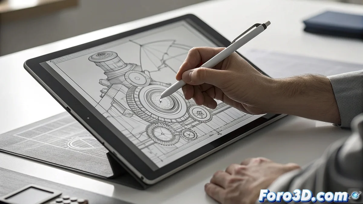
Discover Line Weight Hierarchy in Drawing and Illustration
The line weight hierarchy represents an essential concept in the art of drawing and illustration. It involves using intentional variations in line width to establish depth, outlines, and accents in a composition. This approach guides the viewer's eye and creates a clear structure. Thicker strokes highlight main edges of objects or nearby components in space. In contrast, thin lines capture secondary aspects, patterns, or elements that appear distant. This way, a perception of volume and organization is achieved without resorting to elaborate shading. 🎨
Fundamentals of Hierarchy in Action
To implement this principle, start by marking silhouettes and key edges with the thickest stroke, which gives visual weight and solidity to the elements. Then, apply intermediate thicknesses to define internal sections and shapes within the main subject. Finally, use very thin lines for minor elements like wrinkles, textures, or environmental backgrounds. This progression separates visual planes and prevents the work from looking monotonous or cluttered. It is valuable in both traditional and digital methods, where it is adjusted via pressure or tool size.
Practical Advantages of Hierarchy:- Establishes weight in main outlines for immediate presence 🖼️
- Delimits internal planes with medium strokes for clarity
- Adds fine details that suggest distance and texture
- Facilitates precise control in digital software
Influence on Clarity and Artistic Character
This methodology not only enhances the understanding of an illustration but also shapes its aesthetic and atmosphere. A pronounced application creates a graphic and vibrant style, while gradual transitions infuse realism and delicacy. In storyboards and comics, it is vital for guiding narrative flow. In design concepts, it allows conveying ideas quickly and precisely. By mastering it, the creator controls how the image is interpreted, highlighting priority information.
Effects on Style:- Dynamic look with marked contrasts for visual impact ⚡
- Subtle realism through smooth gradations
- Narrative direction in sequential media
"A drawing with uniform lines is like a monotonous dialogue, without accents or interruptions, which disorients the eye on priorities" – Illustration expert from foro3d.com
Why Master This Essential Technique
The line weight hierarchy transforms flat illustrations into lively and organized compositions. Integrate this tool into your creations to enhance depth and emphasis, elevating the visual impact of your artistic works. ✏️