Visual Transformation for Young Audiences
The Super Very More studio has developed a complete identity overhaul for a children's television channel. This project goes beyond a simple graphic change, redefining how children interact with content. The proposal is based on the concept of shared play, integrating this philosophy into every visual aspect.
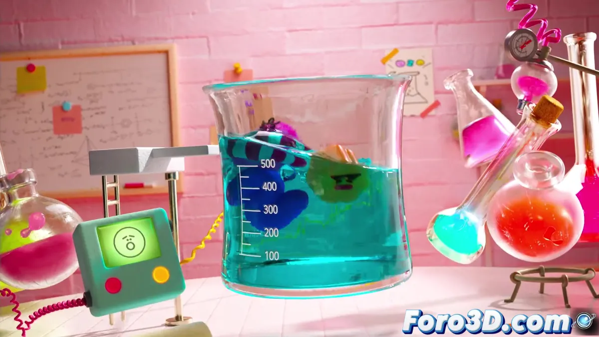
Dynamic Elements That Come to Life
The redesign is characterized by components that constantly evolve:
- Transformable logo with multiple textures
- Characters with unusual materials and virtual touch
- Smooth transitions between scenes
- Educational elements subtly integrated
This approach creates a coherent yet surprise-filled visual universe that stimulates children's imagination.
Multisensory Design
The experience is not limited to the visual. As the creative team explains:
"Every sound and animation element was designed to complement each other, creating complete immersion"
The vibrant color palette and auditory effects work together to maintain interest and facilitate navigation through the content.
Technological Adaptability
The visual identity was conceived to work perfectly on different platforms and screen sizes. This flexibility responds to the current habits of the young audience, who consume content on multiple devices. Visual coherence is maintained from television screens to the smallest tablets.
Creative Collaboration
The project brought together specialists in various areas, from creative direction to motion design and visual effects. This combination of talents allowed the creation of a complete visual identity system that maintains its essence in different applications and formats.