When letters stop behaving
2025 is the year when typography breaks all the rules: it stretches, twists, dances to the rhythm of the scroll, and even reduces its ecological footprint 🌱. While some continue using Arial as if nothing has changed, the boldest designers are creating alphabets that seem straight out of a science fiction movie... and all without asking permission from the purists.
The 3 pillars of the typography to come
- Disruptive maximalism: Letters that occupy spaces, overlap, and challenge traditional legibility
- Variable fluidity: Fonts that adapt like liquid to different viewports and contexts
- Ecological awareness: Designs optimized to reduce ink and digital energy consumption
"Good typography in 2025 isn't read, it's experienced" - states the creative director of an agency that just launched a font that changes according to the time of day.
Toolkit for typography 3.0
| Technology | Typographic use | Key software |
|---|---|---|
| 3D Animation | Letters that rotate, explode, or transform | Blender, Cinema 4D |
| Variable Fonts | Adaptable weight and width in real time | Glyphs, FontLab |
| WebGL | Interactive typography in browsers | Three.js, Spline |
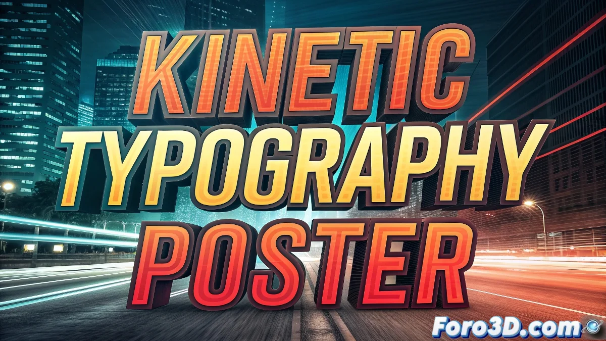
How to create impact (without losing legibility)
- Play with extreme scales - one word can fill an entire screen
- Combine static and dynamic - fix some letters while others move
- Use depth - shadows, extrusions, and 3D cameras
- Experiment with textures - from holograms to distortion effects
Sustainable typography: less ink, more message
New ecological fonts offer:
- Path optimization: Lower ink consumption in printing
- Lightweight: Small files to reduce digital footprint
- Alternative materials: Types designed for printing with vegetable inks
Typographic irony
While we design fonts that respond to mouse movement and change with ambient temperature, 90% of corporate documents still use Calibri 11pt. Perhaps the real revolution isn't in creating smarter letters, but in convincing clients to use them. ✒️
So go ahead: animate, distort, and make your texts dance. But remember - no matter how futuristic your typography is, there will always be someone who asks for "something more classic like Comic Sans".