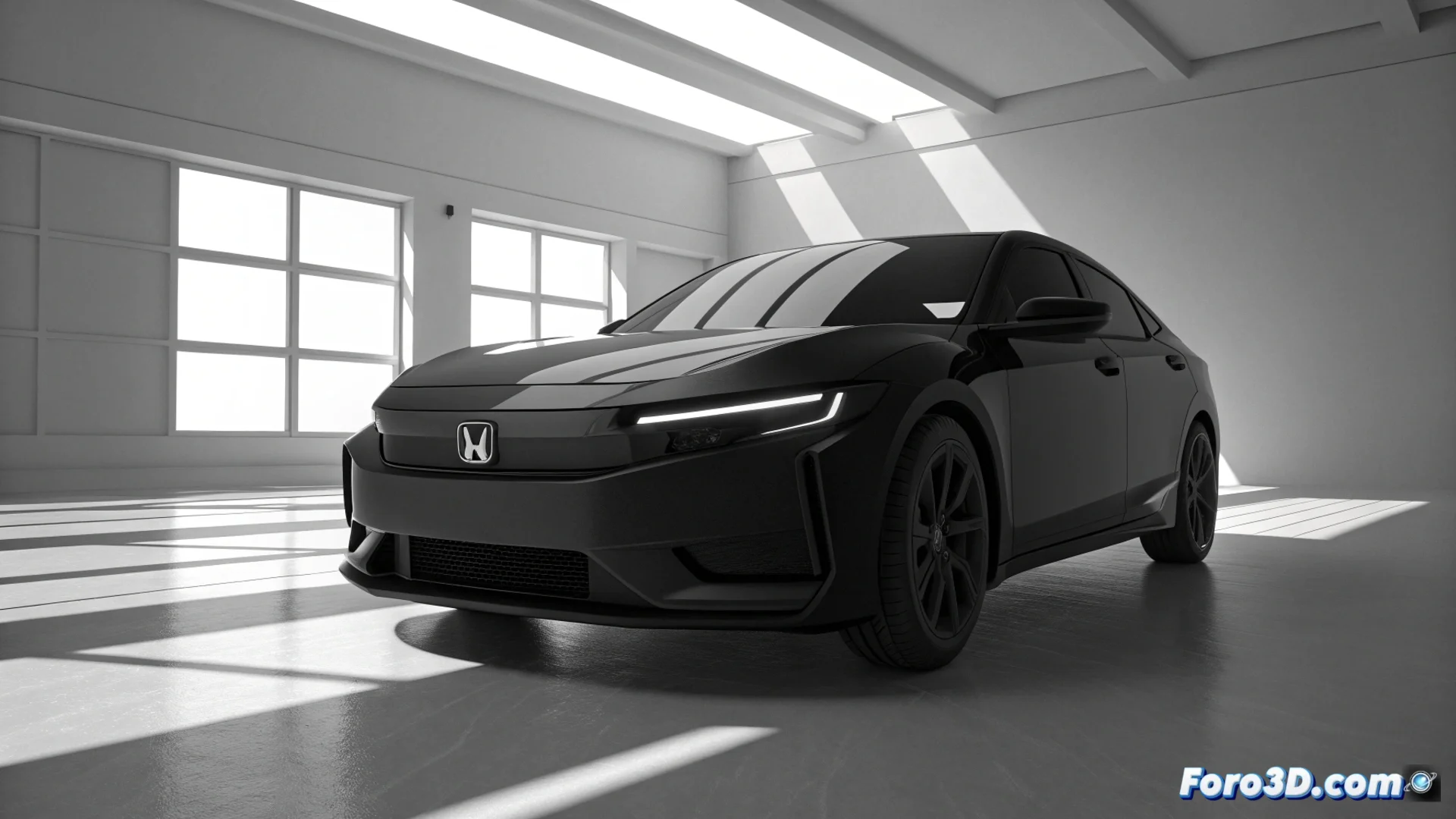
Honda renews its logo to mark its path toward electric cars
The Japanese automotive brand Honda has decided to transform one of its most recognizable symbols: the logo of its automobile division. This change is not just aesthetic, but represents a strategic shift toward electric mobility. The new, more refined and modern design will start to appear on models that the company launches from 2026 onward, marking the beginning of a new era. 🔌
A two-dimensional design for a digital era
The iconic emblem, which consists of a winged H within a frame, completely abandons its three-dimensional appearance and metallic effects. The new version adopts a flat stroke, with thin and uniform lines, in a single color. This approach seeks to convey simplicity and clarity, prioritizing its legibility in digital environments. The company states that this graphic style aligns better with its commitment to developing clean and sustainable technologies.
Main changes in the design:- Eliminates the chrome finish and shadow effects for a two-dimensional look.
- Uses a monochromatic outline with thin and continuous lines.
- Optimizes its display on screens and digital applications.
The evolution of the logo serves as a tangible symbol of Honda's internal transformation toward electrification.
Linked to the debut of the future electric Series 0 lineup
This rebranding does not arrive in isolation. It is directly linked to the launch of the Series 0, the next generation of fully electric vehicles from the brand. The logo renewal accompanies a broader restructuring within Honda, which includes unifying its global R&D operations. The goal is clear: accelerate innovation in electric mobility and create products that stand out from combustion ones.
Strategy behind the new symbol:- Debuts on the first electric models of the Series 0.
- Reflects a corporate restructuring to innovate faster.
- Aims to visually differentiate the new electric products.
A subtle change with a powerful message
Although the transformation may seem subtle at first glance, its meaning is profound. Many drivers will not notice the difference until the famous H stops shining with a 3D effect on the front grille of a new car. This step symbolizes how Honda wants