Graphic Design and the Impact of Visual Noise on User Experience
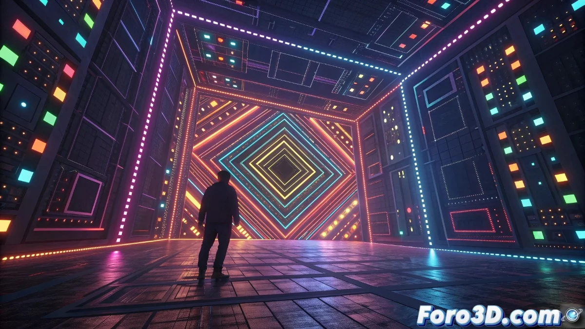
In the realm of contemporary graphic design, numerous visual components can trigger a perception of chaos and overwhelm in those who observe them. These elements, when used without restraint, create a sensory overload that hinders the proper assimilation of the main content. We analyze how an abundance of stimuli competes for attentional focus, producing disorientation and visual fatigue. This perceptual congestion arises when various graphic resources interact in an unstructured way, preventing the eye from locating an area of rest within the design 🎨.
Complications with Overloaded Patterns and Textures
Intricate visual motifs and high-density surfaces are among the primary causes of eye strain. By displaying radical oppositions or disordered sequences, the human visual apparatus must exert excessive effort to interpret the data. This additional work translates into visual fatigue and, in severe situations, can even cause physical discomfort like headaches. The mix of intersecting strokes, dynamically appearing dots, and overlapping figures generates a constant struggle for attention that ultimately exhausts the audience.
Common Manifestations of the Problem:- Patterns with extreme contrasts that force constant refocusing
- High-frequency textures that require intensive visual processing
- Conflicting geometric combinations that create illusions of movement
Sensory saturation occurs when design prioritizes quantity over clarity, preventing effective communication.
Challenges with Color and Excessive Contrasts
Hyper-vibrant color palettes and extreme oppositions substantially contribute to the creation of visual noise. Complementary tones with high saturation, when applied over large areas, produce optical oscillations that fatigue vision rapidly. This color over-saturation creates a persistent flickering effect that hinders the proper interpretation of relevant components. Furthermore, abrupt transitions and sudden variations in brightness force the eye to readjust constantly, increasing the impression of perceptual disorganization.
Factors that Intensify the Problem:- Use of complementary colors on large surfaces without hierarchy
- Abrupt gradients that prevent progressive visual adaptation
- Drastic brightness changes that generate annoying flicker
The "More is Better" Mindset in Design
It seems that certain contemporary designers operate under the premise that abundance equals quality, as if they were compensated for each component added to the layout. This philosophy of "whoever incorporates more elements on screen" results in interfaces that resemble having suffered a detonation in a special effects workshop, where every pixel desperately competes to stand out from its neighbors. The final result are compositions that overwhelm the viewer and dilute the central message, demonstrating that in graphic design, strategic simplicity often surpasses indiscriminate complexity 🖌️.