Google Photos renews its interface with a new visual design
Google's image storage app has implemented a comprehensive redesign in its versions for Android and other platforms. This move directly responds to the new updates in the Material Design language, aiming to homogenize the visual experience for the user. 🎨
Details of the aesthetic transformation
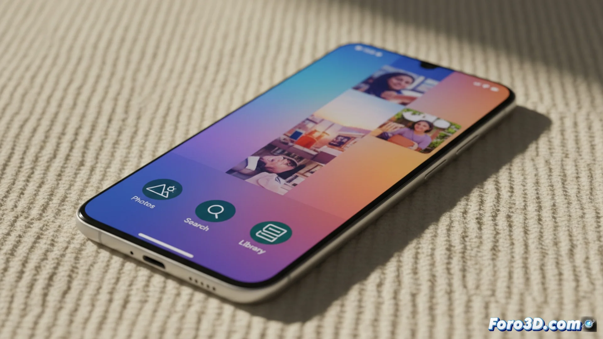
The most evident modification is observed in the main navigation icons. The representations for the Photos, Search, and Library sections now feature a wider stroke and refined shapes. UI elements like share or edit buttons also receive adjustments. These changes follow the principles of Material You, allowing the app to take colors from the user's wallpaper to adapt dynamically.
Main visual adjustments:- Bottom bar icons with thicker lines and subtle redesign.
- Update of action buttons like share and edit.
- Dynamic color palette that extracts tones from the system wallpaper.
Visual evolution is constant in Google's ecosystem. All that's left is to wait for the next redesign to make us learn again where each function is.
How the new interface affects the user
The renewal prioritizes coherence and legibility. Aligning the graphics with the operating system's current visual language makes switching between apps smoother. Users with Android 12 or higher will perceive deeper integration with the phone's customization options. The goal is to minimize visual friction and help focus on the image gallery.
Impact on the experience:- Smoother transitions between apps thanks to visual coherence.
- Advanced integration with customization features in Android 12+.
- Gradual rollout of the update, so it reaches users at different times.
Reception and future perspective
Some users express nostalgia for the previous icons, but this step is part of the natural evolution of digital platforms. The update reinforces Google's philosophy of unifying the look across all devices where its service operates. The key lies in how this dynamic and adaptable design makes the app feel like a native extension of the system. 🔄