Digitally Interpreting the Prado's Blue Transformation 🎨
The Prado Museum has surprised its visitors by painting its main gallery in intense blue, creating a striking contrast with the masterpieces of Titian and Rubens. This bold decision seeks to offer a new visual and emotional experience in one of the most emblematic spaces of European art. Parallely, the inauguration of an exhibition dedicated to Antoni Clavé in Barcelona reinforces Spanish cultural vitality. Both initiatives inspire a digital recreation that explores how color transforms spatial perception using tools like Animation:Master.
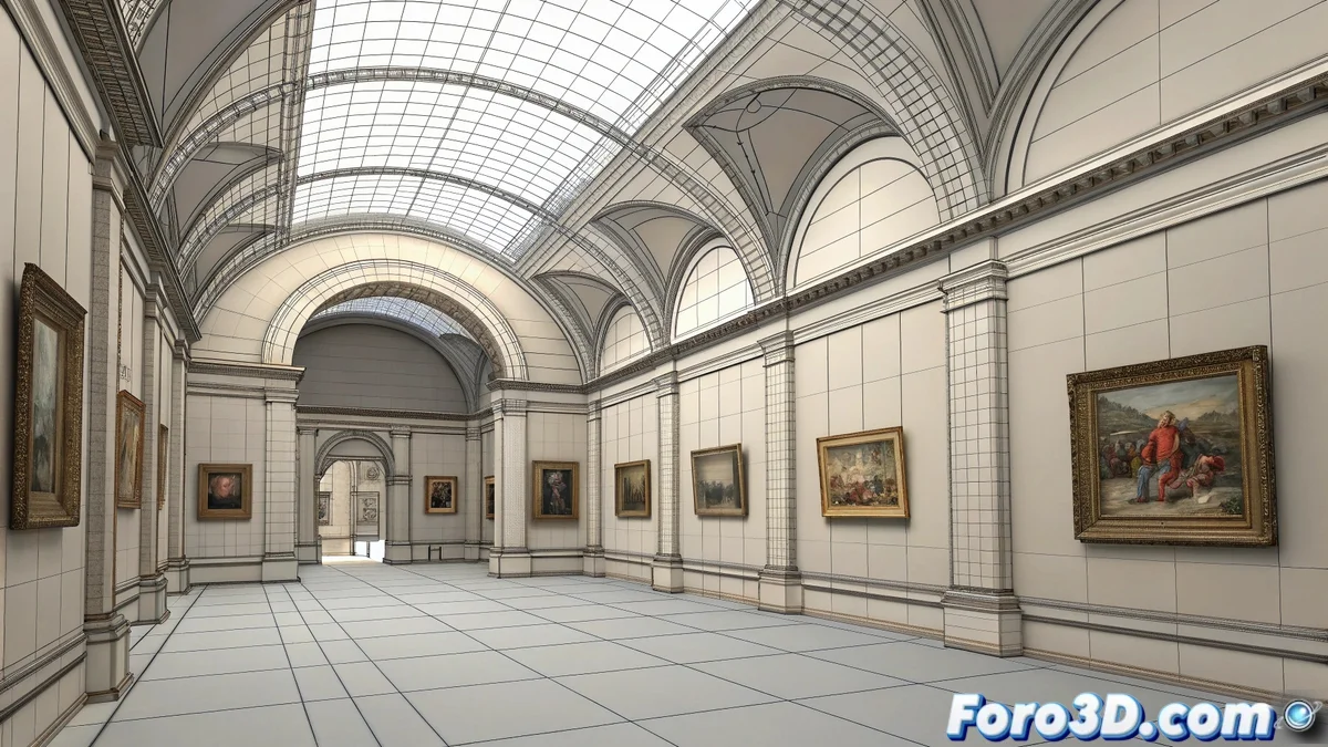
Modeling the Architecture with Splines
Animation:Master, known for its spline-based approach, is ideal for capturing the architectural essence of the Prado's main gallery. The process begins by modeling the vaults, cornices, and walls using curves that are extruded and assembled modularly. The software's lightness allows for rapid iteration in spatial composition, prioritizing the purity of forms over hyperrealistic detail. This minimalist approach aligns with the museological intention: to make the blue color and the works the protagonists. 🏛️
The Power of Chromatic Contrast
The heart of this recreation lies in the contrast between the deep blue of the walls and the golden frames of the masterpieces. In Animation:Master, flat materials and simple shaders are applied to emphasize this duality without distractions. Titian and Rubens' paintings are incorporated as textured planes, carefully lit to simulate how the new blue background enhances their chromatic intensity. The software's simplicity becomes an advantage, allowing focus on the relationship between color and space.
Blue is not just a background color; it is a protagonist that dialogues with each work, modifying its perception and emotional impact.
Spatial Composition and Atmosphere
The distribution of the works within the virtual gallery follows the principles of real museography, creating visual rhythms and points of interest. Animation:Master allows experimentation with camera angles that replicate the visitor's experience: general views that show the immensity of the space and close-ups that reveal the dialogue between the blue of the walls and the golds of the frames. The lighting, though basic, is adjusted to generate a serene and contemplative atmosphere.
Workflow and Significant Details
The creative process is organized into clear phases:
- Architectural modeling using splines and extrusions
- Material assignment of flat colors with pure hues
- Strategic placement of the works as textured planes
- Camera adjustment to capture emblematic perspectives
The texturing of the paintings is simplified using reference images projected onto simple geometry, ensuring that the focus remains on the overall impact of the color.
Between the Physical and the Digital: A Chromatic Homage
This recreation serves as a bridge between the physical experience at the Prado and free digital interpretation. While Madrid visitors enjoy the blue transformation in situ, 3D artists can explore how color modifies spatial perception under digital rules. Animation:Master, though unconventional for architectural visualization, proves its worth for aesthetic experiments where the idea prevails over photographic realism.
While the Prado dresses in blue to enhance its treasures, we dress in patience so that the render doesn't turn the golds into mustard. In the end, the true art lies in making the digital evoke the physical without copying it. 😉