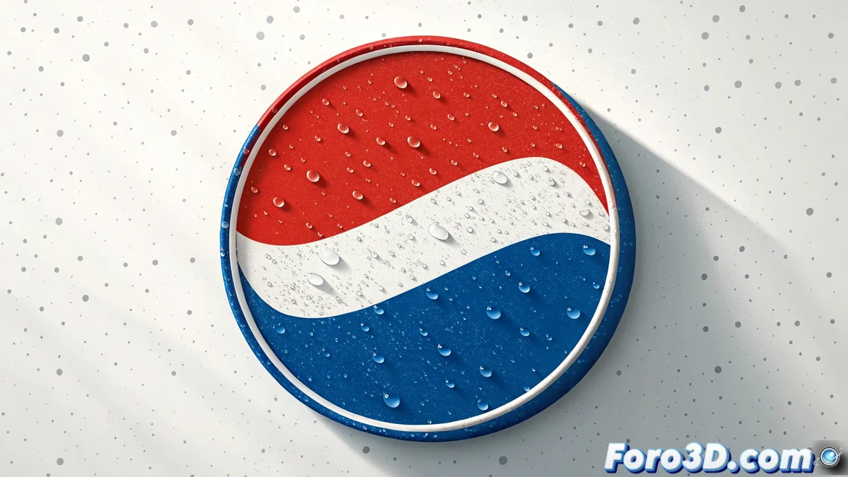
The Art of Recreating an Icon: Pepsi-Style Logo in Photoshop
Creating a logo inspired by Pepsi's involves working with simple geometric shapes, vibrant colors, and balanced composition 🎨. Photoshop allows you to do this by combining vector tools, layers, and effects with precision. The key is to first define the base circles, the central wavy stripe, and the color palette, then gradually add shadows, gradients, and lighting adjustments that give the design volume and a professional style. This exercise is perfect for mastering essential vector design techniques.
Defining Shapes and Base Structure
The process begins with creating the fundamental shapes:
- Ellipse Tool: Create perfect circles by holding down Shift
- Precise Pen Tool: Define the central wavy stripe with controlled curves
- Guides and Rulers: Maintain exact symmetry and proportions
- Organized Layers: Separate elements into logical groups
- Perfect Alignment: Use alignment tools for precision
- Smart Duplication: Copy and transform elements while maintaining relationships
This solid foundation is essential for the rest of the process 📐.
Applying Color and Visual Effects
The magic happens with the application of color and effects:
- Color Palette: Red, white, and blue with exact values
- Gradient Overlay: Smooth gradients to create depth
- Layer Styles: Apply multiple non-destructive effects
- Gradient Angles: Adjust direction for visual dynamism
- Controlled Transparencies: Opacity for overlay effects
- Color Swatches: Save colors for consistency
These techniques transform flat shapes into three-dimensional elements ✨.
Final Details and Preparation for Production
The final adjustments ensure professional quality:
- Drop Shadow: Subtle shadows for visual separation
- Bevel & Emboss: Emboss effects for three-dimensionality
- Smart Objects: Conversion to preserve scalable quality
- Vector Export: SVG or PDF formats for multiple uses
- Alternative Versions: Adaptations for different backgrounds
- Documentation: Usage guides and color specifications
This attention to detail guarantees versatility and professional quality 🚀.
Designing a Pepsi-style logo is fun until you try to get the central curve exactly right
In the end, recreating the Pepsi logo in Photoshop is an exercise in humility and precision. While big brands spend millions on design and research, we discover that the real battle is between our eye, our mouse, and that damn curve that never looks perfect... but at least our efforts don't require marketing committee approval 😅.