Custom Typography: The Answer to the Oversaturation of Generic Minimalist Logos
The landscape of visual identity design is at a crossroads. The obsessive pursuit of simplicity and scalability has created a sea of indistinguishable logos: sans-serif geometries, similar weights, and a dangerous visual homogenization. In the face of this oversaturation of generic proposals, a trend emerges strongly as both a solution and a statement of principles: Custom Typography. This approach rejects relying on abstract symbols or system fonts, and instead, transforms the company's own name into a unique symbol by creating letters from scratch, designed to tell a specific story and possess an unmistakable personality. ✍️
The Rebellion Against the Generic
For years, the "less is more" mantra led many brands into an aesthetic dead end. The result is identities that, while functional, lack soul and are interchangeable with each other. Custom typography is the conscious rebellion against this dynamic. Designers no longer ask "which existing font best represents this brand?", but "what shape must these letters have so they can only belong to this brand?". This shift in mindset places singularity above convenience, and authenticity above imitation. In a world of copies, original authorship becomes the most precious asset.
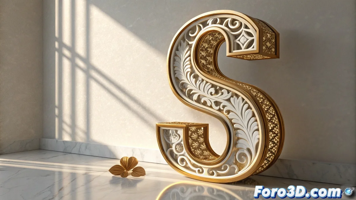
Elements of custom typography that make a difference:- Exaggerated and sculptural serifs that break traditional molds
- Peculiar ligatures that join characters in unexpected ways
- Unusual proportions in ascenders and descenders
- Terminals and serifs with distinctive organic or geometric shapes
- Unique calligraphy that mimics the human stroke in a stylized way
Designing Letters, Not Just Logos
The creation of a custom typeface is a much deeper process than designing a logo. It involves thinking about a complete character system, where every letter, number, and punctuation mark must maintain the same narrative essence. An exaggerated serif on the 'T' must have a recognizable relative on the 'I'; a peculiar ligature between 's' and 't' must feel like a natural evolution of the alphabet, not an isolated trick. This holistic approach transforms what could be a simple name into a coherent and expandable visual ecosystem, which can grow with the brand and be applied consistently across all its touchpoints.
Custom typography is not chosen from a menu; it is cultivated from the root of the brand's identity.
Telling Stories Through the Shape of Letters
Every formal decision in a custom typeface is loaded with meaning. Exaggerated serifs can evoke a craft heritage or centuries-old solidity; peculiar ligatures can suggest interconnection and fluidity; unique calligraphy can convey the authenticity and human touch behind a company. The shape of a 'g' can reflect innovation, while the curve of an 's' can speak of the brand's flexibility. This level of typographic storytelling creates an emotional connection with the viewer that an abstract symbol or a generic font could never achieve. Typography ceases to be a vehicle for text and becomes the message itself.
Strategic advantages of custom typography:- Absolute differentiation in a saturated market
- Stronger legal protection as it is a proprietary design
- Ability to express nuances of brand personality impossible to achieve otherwise
- Creation of a visual asset of lasting value and difficult to replicate
- Deeper connection with the audience through detail and craftsmanship
The Name as the Supreme Visual Asset
In this new era, the company name, through its custom typography, becomes the most valuable visual asset. It