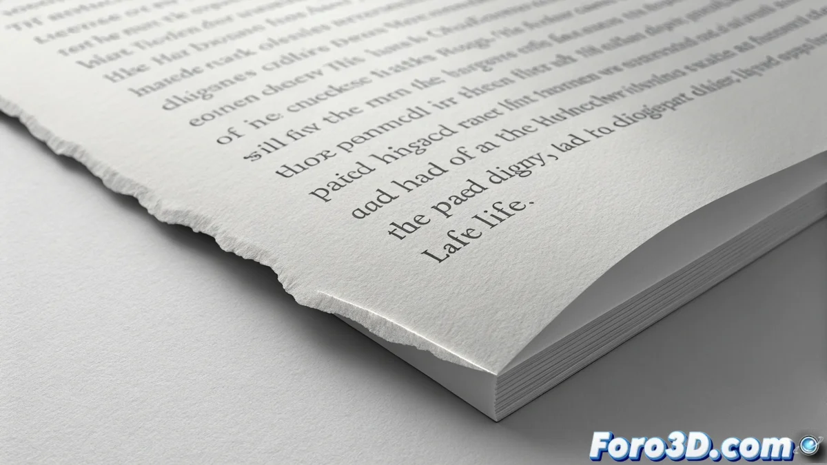
Controlling Typographic Rag to Improve Readability
In typography, the rag or ragged edge refers to the irregular outline formed on the opposite side of the aligned side of a paragraph. When this profile is uncontrolled, it generates intrusive visual shapes that interrupt reading. These interferences break the rhythm and make the text appear less professional. The goal is to achieve a rag that, although it seems casual, is meticulously crafted to guide the eye smoothly between lines. 🧐
Why Polishing the Text Edge is Crucial
A neglected rag is not just an aesthetic detail. It creates noticeable white gaps and repetitive patterns that involuntarily capture attention. This forces the brain to process the shape instead of the content, slowing down reading and tiring the reader. A well-adjusted edge, on the other hand, goes unnoticed, allowing the user to focus on the message. It is the foundation of a solid and readable typographic composition.
Main Problems of a Poor Rag:- Undesired Visual Rhythms: Sequences of lines with identical lengths that create a distracting pattern.
- Pronounced Steps: Excessively short lines followed by very long ones, generating a jagged profile.
- White Rivers: Vertical channels of space that accentuate irregularity and fragment the text block.
A perfect rag is like a good supporting actor: it goes completely unnoticed, but if it does its job poorly, everyone notices and ruins the performance.
Main Method: Manually Adjusting Line Breaks
The most effective technique for controlling the rag is to review the text and force manual line breaks. This involves inserting soft returns or, even better, slightly rewriting sentences. The purpose is to break overly long lines that leave large gaps and shorten very short lines that form steps. The aim is to create a general profile with smooth and organic variation, avoiding mechanical repetition of lengths.
How to Implement This Adjustment:- Identify Problematic Lines: Look for those that are noticeably longer or shorter than their neighbors.
- Insert Soft Returns: Use the corresponding command in your design software (Shift + Enter in many cases) to split a word or phrase.
- Rewrite for Clarity: Sometimes, slightly changing the wording produces a more natural text flow and a more balanced rag.
Support Tools: Syllable Division and Spacing
Activating syllable division (hyphenation) is a great support, as it allows breaking long words at the end of a line, smoothing the edge. Equally important is adjusting the spacing. Excessive space between words creates those white rivers that highlight irregularity. Fine-tuning the tracking (general spacing) and kerning (spacing between specific letter pairs), along with careful justification if used, helps achieve a more uniform gray texture throughout the text column.
In summary, mastering typographic rag is an essential skill for anyone working with text. It's not about seeking rigid perfection, but about orchestrating irregularity so that the eye glides across the page effortlessly. Combine manual review with intelligent use of your software's tools so that the formatting of your texts reinforces, never hinders, communication. ✅