Composing with Unbalanced Visual Weight to Generate Tension
In graphic design and illustration, a powerful technique consists of distributing visual weight radically. All elements with the greatest impact are concentrated in a single area of the canvas, while the rest of the space remains deliberately empty. This method breaks the classical rules of balance to provoke a specific emotional reaction in the viewer. 🎨
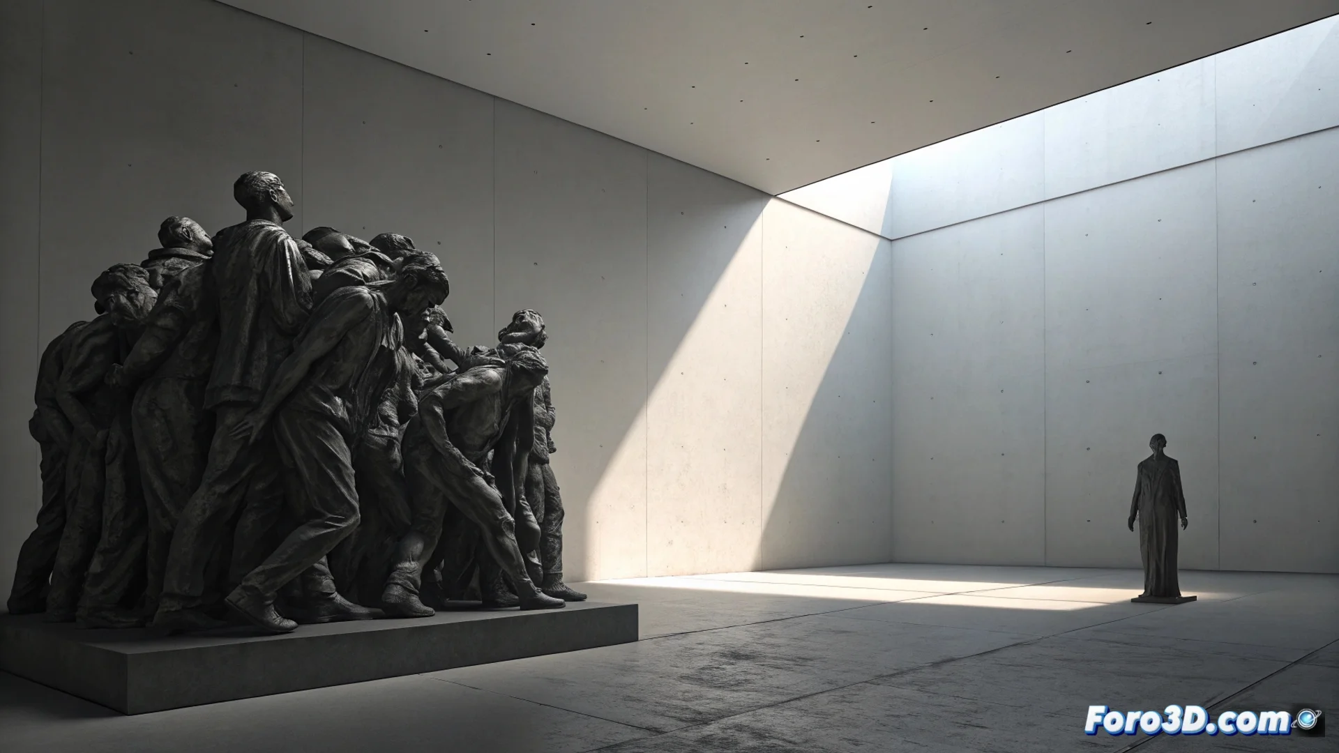
The Principle of Intentional Imbalance
The technique works by grouping what is visually heavy: large objects, dark or highly saturated colors, and high contrast. These are placed in one half of the composition. The other half is left with minimal, subtle elements or completely empty. This extreme asymmetric distribution produces a physical sensation of instability, as if the image were about to tilt or fall toward the loaded side. The gaze does not find a resting point, generating tension that can unsettle or intensely capture attention.
Key characteristics of this composition:- Extreme concentration: All heavy elements are clustered in a defined area, without smooth transition elements.
- Radical emptiness: The opposite space is simplified to the maximum, using plain backgrounds, subtle gradients, or almost imperceptible details.
- Implicit dividing line: The boundary between the filled and empty zones can be clear or suggested, but the separation is evident.
- Forced attraction: The view is directed almost obligatorily toward the focus of greatest visual density.
A painting hung this way on a wall would make people unconsciously lean as they pass by, trying to compensate for the missing weight.
Contrast with Classical Balance
In a traditional composition, the goal is to balance visual weight. A strong element on the left is balanced with another on the right, or with several smaller elements distributed. This counterweight creates harmony and stability. By deliberately omitting this resource, predictable harmony is destroyed. The decision not to balance is fundamental; it is not an error, but an expressive tool to communicate conflict, anxiety, overwhelming decision, or contained energy.
How to apply imbalance effectively:- Define a single main focus: Decide which element is the most important and give it maximum weight using size, contrast, or saturation.
- Empty the space decisively: Do not fear leaving large areas without relevant elements. Simplicity in the empty zone accentuates the weight of the focus.
- Seek emotional impact: Use this technique when you want the viewer to perceive unease, tension, drama, or an irresistible visual attraction.
- Avoid intermediate points: The key is the radical decision: either a lot of weight or almost nothing. Transition elements weaken the effect.
When and Why to Use This Technique
This compositional approach is ideal for transmitting intense emotions or complex abstract concepts. It is used in horror movie posters, book covers about conflicts, conceptual illustrations on loneliness or pressure, and art that seeks to provoke a visceral reaction. The tension it generates directs the viewer's attention in a powerful and memorable way, making the central message endure. It is an advanced tool that, used with clear intention, elevates the visual discourse of any graphic piece. ⚖️