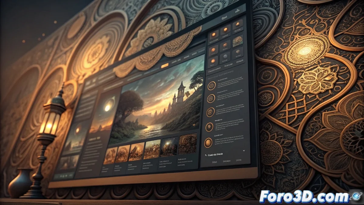
Complex Backgrounds in Interface Design: The Silent Enemy of Readability
In the universe of interface design, visually saturated backgrounds represent one of the most common mistakes that compromise effective communication between the platform and its users. When intricate patterns, highly contrasted images, or excessive textures compete for the viewer's attention, the textual content inevitably loses prominence and clarity 🎨.
The Cognitive Impact of Overloaded Backgrounds
Visual fatigue emerges as a direct consequence when our eyes must constantly readjust focus between multiple visual planes. Studies in visual ergonomics confirm that this situation not only reduces reading speed by approximately 40%, but also increases comprehension errors in users of all ages. People with astigmatism or contrast sensitivity experience particularly severe effects, from simple discomfort to persistent migraines after prolonged exposure.
Documented Consequences:- 30-50% reduction in retention of key information
- 60% increase in platform abandonment rates
- Notable decrease in overall user satisfaction
Effective design occurs when aesthetics serve functionality, not when it compromises it - Fundamental principle of user-centered design
Practical Strategies to Balance Aesthetics and Functionality
The solution lies in applying hierarchical design principles where controlled contrast becomes the main ally. Backgrounds must act as supporting elements that generate depth and context without interfering with the readability of the main content. Techniques such as Gaussian blur applied strategically or the use of semi-transparent layers allow for effective visual separation while maintaining aesthetic appeal.
Proven Techniques for Effective Backgrounds:- Use of desaturated colors with subtle tonal variations
- Implementation of overlays with adjustable transparency
- Application of the "removable design" principle where the decorative does not affect the functional
The Paradox of Counterproductive Design
It is particularly ironic when designers select premium typographies with impeccable technical criteria, only to hide them behind backgrounds that make them practically illegible. This situation is equivalent to presenting an exquisite culinary composition on dishware with patterns so complex that they completely distract from the gastronomic content. Function must always precede form in effective interface design, ensuring that every visual element serves a specific purpose within the user's overall experience ✨.