Chromatic Vibration: The Visual Phenomenon That Challenges Design
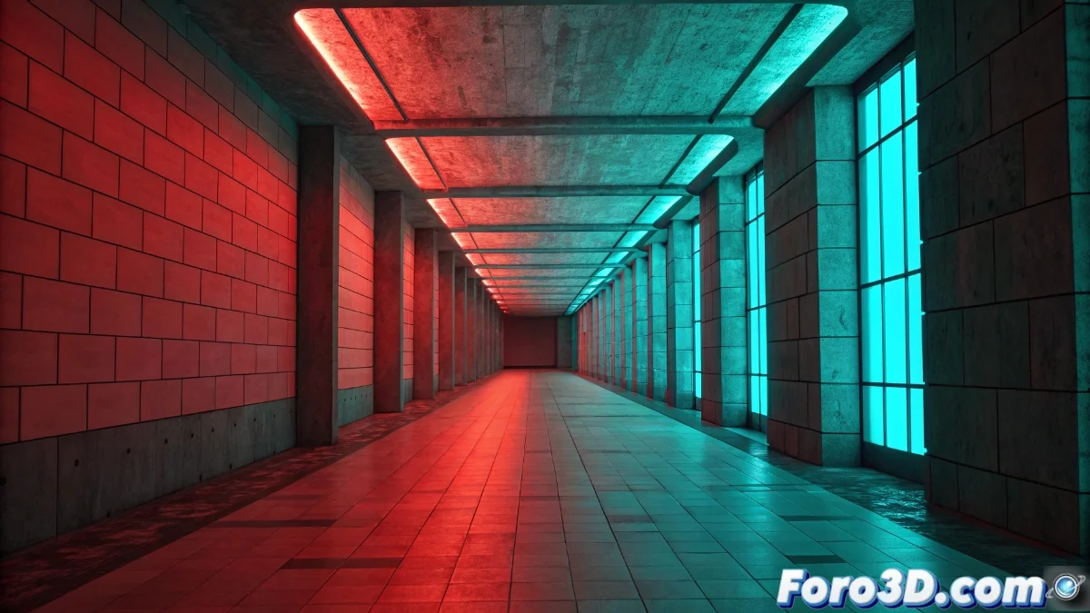
Color vibration is a phenomenon that occurs when we use complementary tones with extreme saturation, generating an aggressive visual interaction that can be uncomfortable for the viewer. This effect not only distorts the perception of edges but can also cause eye fatigue after prolonged exposure, a crucial aspect that designers must consider when creating compositions intended to hold the user's attention. 🎨
Mechanisms Behind Chromatic Vibration
The effect originates in how our visual system processes intense complementary colors simultaneously in the retinal receptor cells. When combinations like red and cyan or yellow and blue reach maximum saturation and are placed adjacent, the human eye struggles to focus on them correctly. This perceptual struggle triggers constant micro-ocular movements, which the brain interprets as vibration in the chromatic boundaries, forcing the visual system to overwork to maintain clarity. 👁️
Key Factors in the Appearance of the Effect:- Use of complementary colors with extreme saturation
- Immediate proximity between conflicting tones
- Individual characteristics of human visual perception
Chromatic vibration is like a silent battle between colors competing for our retina's attention.
Strategies to Neutralize Unwanted Vibration
There are multiple approaches to mitigate this issue without sacrificing the visual impact of our compositions. Slightly reducing the saturation of one or both colors maintains the necessary contrast while eliminating the annoying vibration. Introducing smooth transitions through gradients or neutral separation lines also proves highly effective. Another viable alternative is to increase the space between conflicting color elements or use less extreme tone variations that preserve chromatic harmony without causing visual fatigue. 🛠️
Practical Techniques for Designers:- Controlled adjustment of chromatic saturation
- Implementation of gradients and transitions between problematic colors
- Modification of spacing and layout of contrasting elements
Balance Between Artistic Expression and Visual Comfort
Chromatic vibration represents a fascinating challenge in the world of design, where colors seem to take on a life of their own and create their own visual choreography. Understanding its mechanisms and applying the appropriate solutions allows creators to maintain the perfect balance between artistic expressiveness and the viewer's visual well-being, ensuring that our compositions are both impactful and sustainable for the human eye. ✨