When Colors Reach Critical Temperature
Gradients have stopped being subtle to become authentic thermonuclear explosions of color 🔥. The "heat map" style is invading 3D design with its abrupt transitions between incandescent reds and electric blues, as if your renders had been scanned with alien thermal vision.
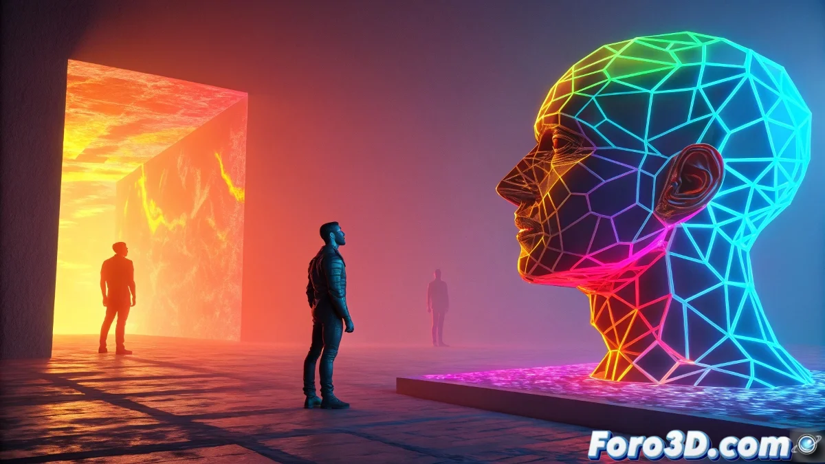
Anatomy of a Retina-Burning Gradient
- Extreme Range: From #FF0000 (flames) to #0000FF (cosmic ice)
- Break Points: Abrupt transitions that create visual tension
- Maximum Saturation: Colors that challenge RGB standards
- Implicit Texture: Radiant energy or hot metal effect
"A good thermal gradient isn't seen, it's felt" - says the designer while adjusting the fourth level of saturation in Photoshop.
Application Techniques in 3D Pipelines
| Method | Advantage | Ideal Software |
|---|---|---|
| Post-processing | Non-destructive - editable | Photoshop/After Effects |
| Custom Shader | Interactive in viewport | Blender Nodes/Substance |
| Volumetric Lighting | Real 3D effect | Cinema 4D/Redshift |
5 Steps to Burn Color Codes
- Render your scene with luminosity/Z-depth passes
- Create masks based on lighting values
- Apply gradients with "Color Dodge" or "Vivid Light" blend modes
- Add noise to break artificial patterns
- Balance with deep blacks (#000000 without fear)
Projects Defining the Trend
- Music Covers: Hyperpop and experimental electronic albums
- Visual Identity: Energy and radical technology brands
- Digital Art: NFTs with extreme data visualization aesthetics
- Motion Graphics: Transitions simulating plasma explosions
The Chromatic Paradox
While design gurus preach moderation, thermal gradients prove that sometimes excess is the way. After all, if your design doesn't make viewers instinctively rub their eyes... are you really using enough saturation? 🌈
So go ahead: crank up that contrast, distort those color channels, and make your renders look like they're from a fusion reactor. And when someone asks if it's "too intense," just smile and say: "That's the point."