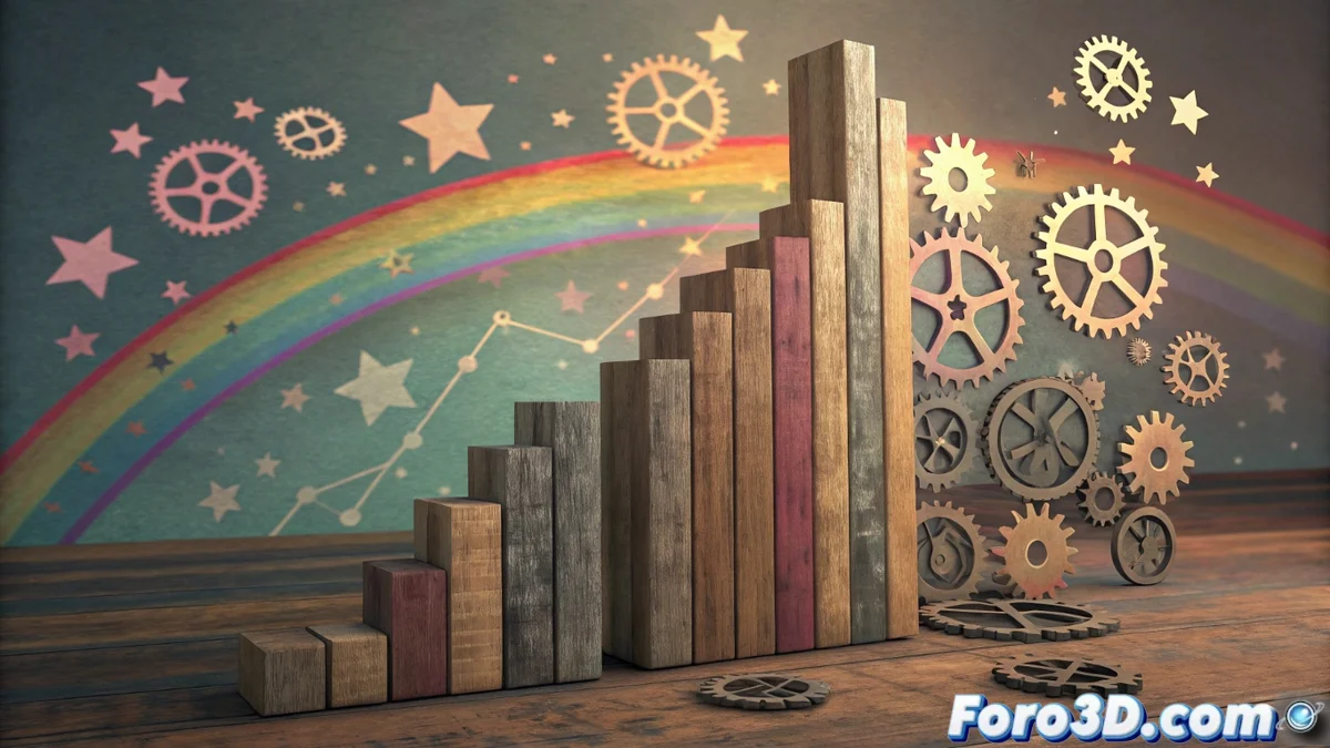
Chart junk: when visual design hinders data comprehension
In the fascinating world of graphical information representation, there is a silent enemy of clarity: chart junk or graphical garbage. 🗑️ It refers to all those ornaments, effects, and decorative elements that, although well-intentioned, do not add informational value and end up obscuring the main message. Its presence, far from helping, saturates the visualization and diverts the viewer's attention from the essential: the data and their patterns.
The high cost of visual noise
The inclusion of this "garbage" has a direct and negative impact on readability. Elements like exaggerated shadows, irrelevant textures, or intrusive thematic illustrations introduce significant visual noise. This forces the brain to perform extra filtering work, increasing cognitive load and slowing comprehension. In fields where precision and speed are critical, such as data science or engineering, this obstacle can be costly. A line chart with a neon background or a pie chart with distorted 3D effect are classic examples of how the simple can be complicated.
Common examples of chart junk:- Unnecessary 3D effects: They distort the perception of proportions and volumes, making comparing values a guessing task. 📊
- Complex textures and gradients: Backgrounds with gradients or patterns that visually compete with the data, creating confusion.
- Decorative iconography: Images or symbols that do not add new information and only serve as aesthetic filler.
- Excessively ornate typographies: Letters that are hard to read, prioritizing form over function.
- Superfluous grid lines and borders: Structural elements that multiply unnecessarily, saturating the space.
- Redundant or over-explained legends: Information that is already evident in the chart or could be integrated more efficiently.
The main goal of a data visualization is to communicate information, not to decorate a page. Every pixel must earn its place.
Towards an elegant and efficient design
The philosophy opposite to chart junk is based on functional minimalism. Influential thinkers like Edward Tufte promoted the concept of maximizing the data-ink ratio. This means dedicating the majority of visual resources (ink on paper or pixels on screen) to representing real information, meticulously eliminating everything accessory. The result is not boring charts, but elegant, clear, and powerful ones. It is about design acting as a transparent channel, allowing the data to "speak for themselves" without interference. 🎯
Key principles for effective visualizations:- Prioritize clarity over decoration: Every element must justify its existence by its informational value.
- Eliminate the redundant: Review and remove lines, labels, or effects that do not add new meaning.
- Use color purposefully: Color should highlight categories or values, not just be decorative. 🎨
- Simplify typography: Choose readable fonts with high contrast against the background.
- Optimize white space: Use negative space to guide the eye and provide visual breathing room.
- Contextualize intelligently: Add only the annotations and legends strictly necessary for comprehension.
Conclusion: less is more intelligent
A sales heatmap doesn't need to shine like a diamond on a dark background, unless the goal is, ironically, to hide a bad streak. 🫣 The battle against chart junk is a battle for visual honesty and communicative efficiency. By adopting a minimalist, data-centered approach, we not only improve readability but also respect the time and intelligence of our audience. In information design, elegance lies in functional simplicity, demonstrating that, very often, less is definitely more... and much more intelligent.