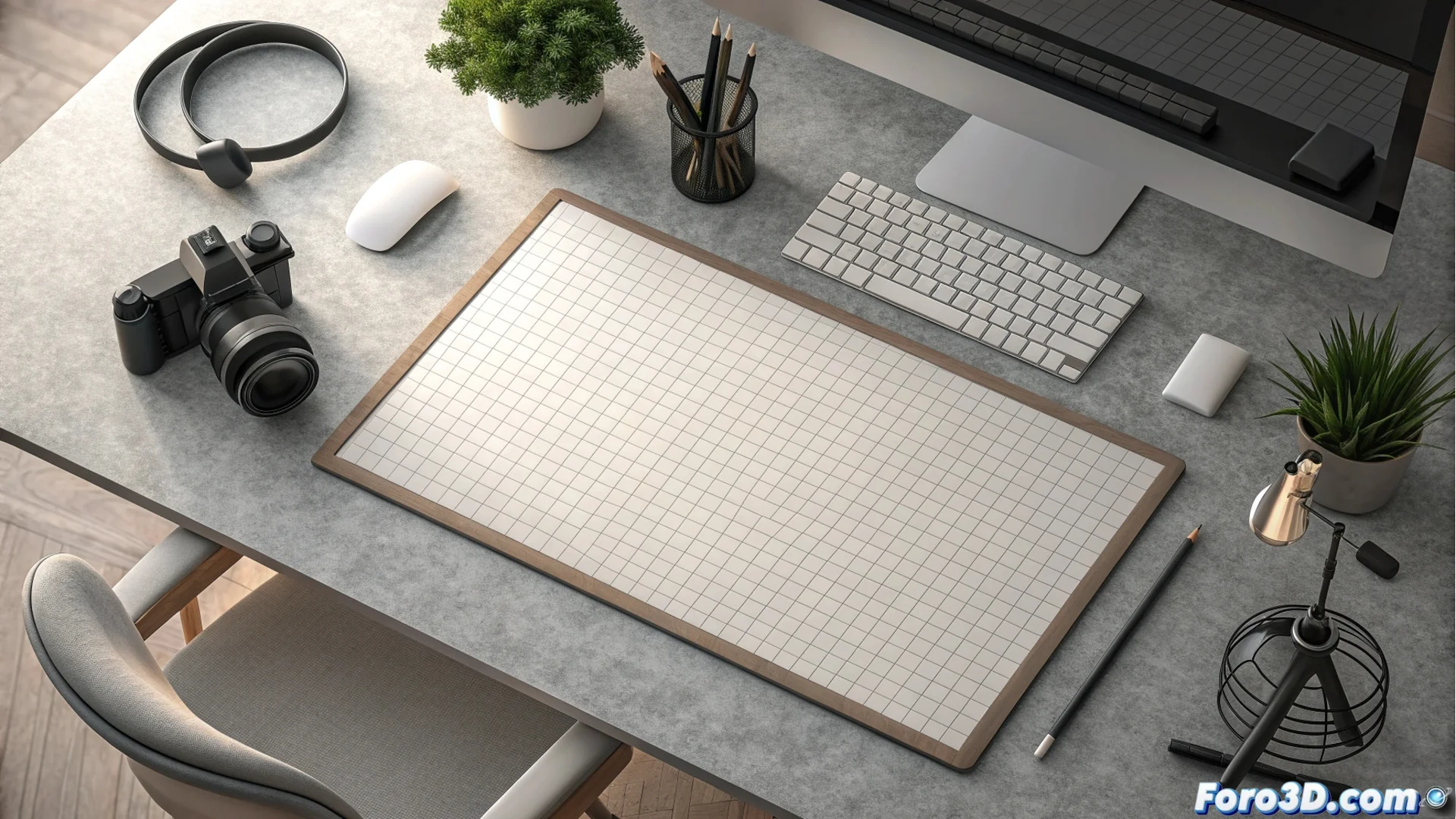
Breathing Spaces in Graphic Design: Why They Are Essential
In graphic design, leaving a margin around the main elements is not a minor detail; it is a fundamental rule. When a logo or block of text is placed too close to the canvas boundary, it creates visual tension that the viewer perceives as uncomfortable and unbalanced. This error makes the element seem trapped or about to escape the frame, distracting from the main message. 🖼️

How to Plan and Apply Safety Margins
To solve this problem, you must define an exclusion zone around the entire perimeter of your design. This area acts as a buffer where no key components are placed. Although the measurement can vary, an effective practical guide is to reserve between 5% and 10% of the total width and height of the document. In complex projects with multiple elements, using a base grid helps organize and maintain visual coherence in the distribution of spaces.
Key Steps to Implement It:- Define the usable area: Establish from the beginning the inner limits where you can place content.
- Use guides and grids: These tools in design software allow you to visualize and respect margins consistently.
- Adjust according to the format: Margins for a social media profile may differ from those for a printed brochure; always check the final context.
A design with adequate space conveys order and clarity. Ignoring this principle can make a job seem rushed or, ironically, look cropped.
The Direct Effect on the Perception of the Work
Respecting these spaces not only solves a technical problem; it transforms how the audience receives your design. A composition with sufficient visual air communicates professionalism, order, and facilitates smooth visual navigation. The eye can move through the information without encountering obstacles or "collisions" at the edges.
Consequences of Not Applying This Principle:- Perception of disorganization: The design may look cluttered and poorly planned.
- Visual overload: Similar to entering a room with furniture stuck to the walls, the experience is oppressive and communication does not flow.
- Lack of balance: The composition loses its gravitational center, making everything seem unstable.
Conclusion: More Than Empty Space
The breathing space is an active element in the composition. It is not wasted area, but a strategic resource that improves readability, visual impact, and the professional quality of any graphic piece. Integrating this habit into your workflow is a safe investment to produce more polished and effective designs. ✅