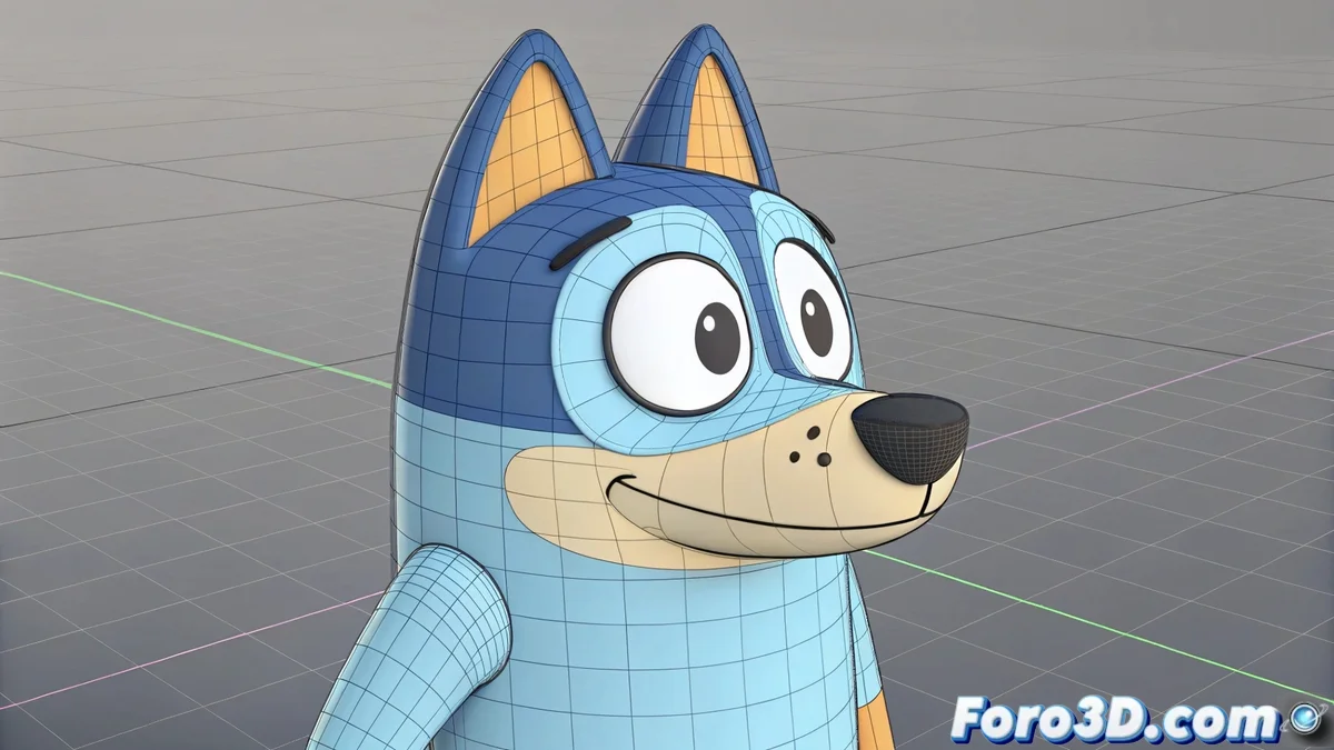
Bluey Grows Up: From the Living Room to the Cinema Without Losing Its Essence
The animated phenomenon that captivated children and parents alike is now making the leap to the big screen, proving that less can be more... but with a few adjustments 🎬. Bluey brings its clean, colorful 2D design to the cinema, where its calculated simplicity faces new technical challenges. How to make those minimalist lines shine in a dark theater? The answer seems to be in enhancing without saturating 🖍️.
"The challenge wasn't to add complexity, but to maintain the visual purity while amplifying its emotional impact," explains the project's art director.
The Visual Formula That Conquered the World
Bluey's success is based on:
- Simple shapes that are highly expressive
- Flat palettes that create visual harmony
- Clean lines that facilitate quick reading
- Economical animation that prioritizes expressiveness
Cinematic Adaptation: The Key Adjustments
For the cinema version, the team implemented:
- Greater richness in backgrounds without losing the flat style
- Amplified facial expressions for the big screen
- Subtle lighting effects that add depth
- Musical sequences with more elaborate animation
Counterpoint: Bluey vs. Cutting-Edge Anime
While contemporary anime bets on:
- Complex 2D/3D integration
- Sophisticated shaders and visual effects
- Extreme detail in characters and settings
Bluey demonstrates that visual strength lies in the clarity of the message, not in pixel density. Its transition to cinema proves that good design doesn't age, it just adapts. As Bandit himself would say: sometimes the simplest ideas are the brightest... even if they now shine a bit more in Dolby Cinema 😉.