Atmospheric Perspective in Digital Illustration
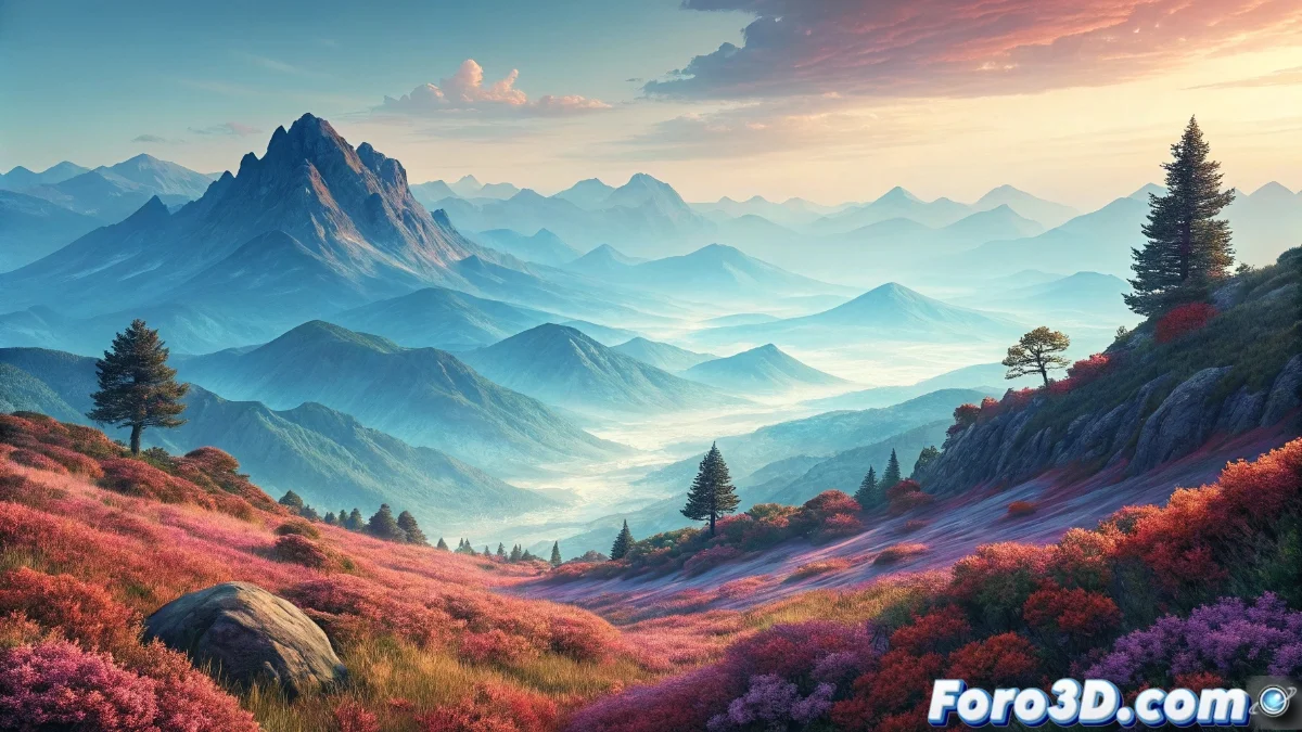
The atmospheric perspective constitutes a fundamental tool that transforms two-dimensional representations into visual environments with convincing depth. This methodology is based on observing how suspended particles in the air modify our perception of distant elements, progressively altering their chromatic and definition characteristics 🌄.
Fundamental Principles of Visual Atmosphere
We understand that the atmosphere operates as a progressive natural filter that transforms the appearance of objects according to their distance. Warm tones shift toward the cool range (blues, grays, and lavenders) as distance increases, gradually losing intensity and saturation. Parallelly, luminosity contrast decreases significantly, generating increasingly diffuse and ethereal silhouettes. Precise details and defined textures methodically fade, being replaced by simplified forms that effectively communicate distance.
Key Visual Transformations:- Chromatic Modification: Transition from warm and saturated colors to cool and desaturated tones
- Contrast Reduction: Progressive decrease in the difference between lights and shadows
- Loss of Definition: Gradual disappearance of fine details and complex textures
The atmosphere not only adds realism but also guides the viewer's gaze through successive planes, creating an immersive and organic visual experience.
Practical Implementation in Digital Environments
To apply this technique effectively, we begin by selecting an evolving chromatic palette that transitions from warm tones to cool ranges according to scenic depth. In the foreground, we use intensely saturated colors like vibrant greens or earthy browns, with pronounced contrasts and sharp details that focus immediate attention. In the midground, we soften the colors toward more subtle versions and moderately reduce contrast, preserving some definition but without rivaling nearby elements. For distant backgrounds, we select pale blues, soft lavenders, or neutral grays, virtually eliminating all details and blurring edges to emulate ambient haze.
Application Strategies by Planes:- Foreground: Saturated colors, high contrast, and maximum detail definition
- Midground: Moderate saturation, reduced contrast, and intermediate definition
- Distant Background: Desaturated cool tones, minimal contrast, and blurred edges
Visual Impact and Final Considerations
This gradual transition generates a three-dimensional space illusion that persuades the viewer they can enter the scene, even on two-dimensional supports like graphic tablets or digital canvases 🎨. Sometimes, after intense work sessions, our landscape acquires such depth that we almost anticipate the flight of a bird from the composition, reminding us then that we have mastered the perspective technique, not visual alchemy. Atmospheric perspective remains one of the most powerful resources for creating convincing depth in digital and traditional illustrations.