A New Windows 11 Patch Breaks the Dark Mode in File Explorer
The latest Windows 11 update, designed to polish and homogenize the dark mode experience across the entire system, has had an unwanted and quite noticeable side effect. Instead of achieving the desired uniformity, it has generated a severe visual inconsistency in one of the operating system's core applications, leaving many users with a fragmented and visually unpleasing interface. 😕
The Visual Glitch That Fragments the Interface
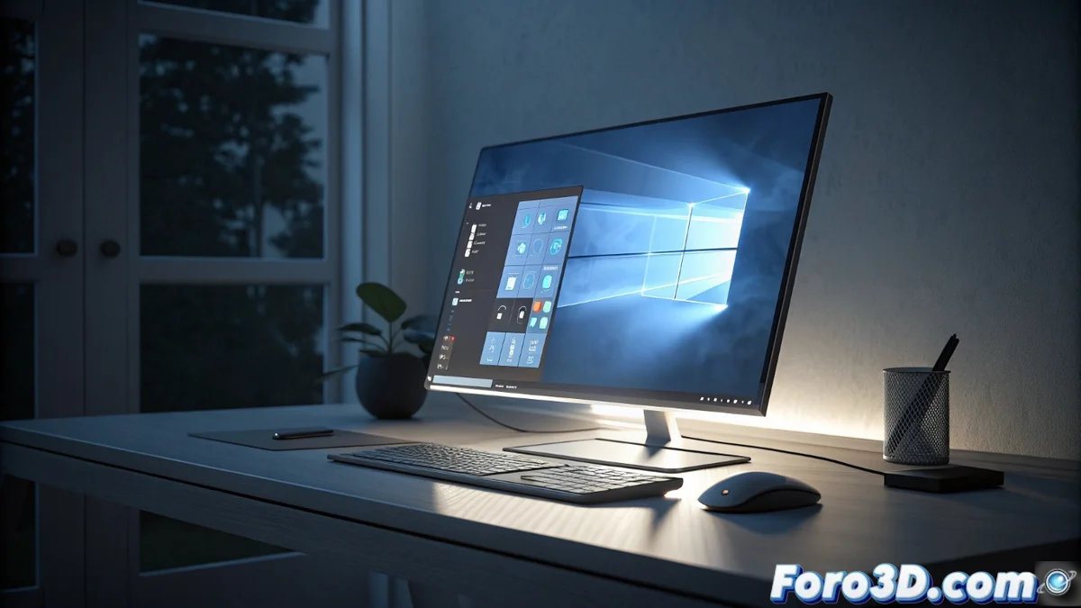
The issue is specifically concentrated in File Explorer. The flaw creates a disconcerting visual experience: while the main window displaying folders and files correctly applies the dark theme, structural elements like the folder tree on the left side and the details panel on the right are displayed with a bright white background and black text. This abrupt contrast is not only unsightly but also impairs usability, especially in prolonged sessions or low-light conditions where dark mode is crucial for reducing eye strain.
Specific areas affected by the bug:- Navigation Panel: The area showing drives, quick folders, and OneDrive appears with a light background, breaking the immersion in the dark theme.
- Details/Preview Panel: The section displaying property information or file previews also suffers from the same incorrect lighting issue.
- Contextual Elements: Some pop-up menus and toolbars may show an incoherent mix of light and dark styles.
"Every attempt to unify the design seems to reveal new seams in the system, and this error is a palpable reminder of that internal struggle in Windows."
Community Reaction and Official Response
The error has been widely reported on support forums, social networks, and user communities, evidencing its impact on a daily-use functionality. In response to the wave of complaints, Microsoft has confirmed that it is aware of the issue and that its development teams are already working on a fix. The solution is expected to arrive via an emergency patch or be included in the next monthly cumulative update. In the meantime, users are faced with less-than-ideal options.
Temporary alternatives for affected users:- Uninstall the update: A radical solution that eliminates the visual bug but also means losing other critical security and performance fixes contained in the patch.
- Switch to light mode: Temporarily use the system's light theme to avoid the discordant contrast, though this is not viable for those who prefer or need dark mode.
- Wait for the official fix: The most common option, which involves living with the fragmented interface until Microsoft distributes the definitive correction.
A Step Back in the Quest for Visual Coherence
This incident highlights the persistent challenges in creating a unified visual ecosystem for a system as complex as Windows. The path to a perfect dark mode seems full of obstacles, where advances in one area can generate unexpected setbacks in another. For users, especially those most sensitive to design or who work in visually demanding environments, these glitches are more than a mere inconvenience; they are a reminder that visual stability is a fundamental pillar of the user experience that still requires much attention and refinement. 🔄