Telegram for Android renews its interface with a liquid glass design
Have you ever opened an app and not known where to tap because they've reorganized everything? 🤔 This is what Telegram for Android users are experiencing now after its latest major update. The app has undergone a complete transformation that changes not only its appearance but also the way to navigate it.
The side menu disappears, bottom navigation arrives
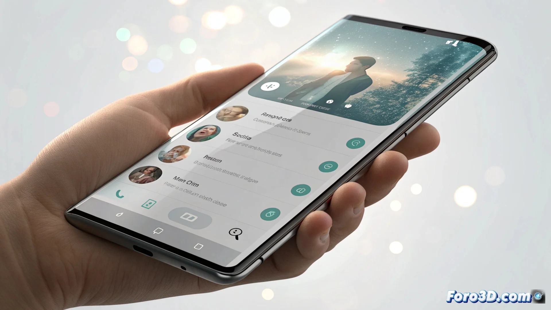
The most significant change is the removal of the traditional hamburger menu, that side panel that slid out from the edge of the screen. In its place, Telegram implements a fixed bottom navigation bar with four direct accesses: Chats, Contacts, Settings, and Profile. It's like suddenly changing the direction of all the streets in a neighborhood. What was previously managed with the hand on the side is now controlled from the bottom, a move designed to facilitate one-handed use, although it may initially disorient.
Main features of the new scheme:- Fixed bottom navigation: Constant access to key sections from the bottom of the screen.
- Greater accessibility: Design optimized to reach buttons with the thumb on large devices.
- Redistribution of functions: Elements that were in the side menu are now located in other parts of the interface.
It's another step for all apps to feel coherent, even if it costs us a few days of clicks in the wrong place.
The Liquid Glass aesthetic arrives on Android
The change is not just functional. The new user interface adopts a visual language called Liquid Glass or liquid glass. This style is characterized by using numerous elements with transparencies and blur effects, very noticeable in the app's light mode. Menus and surfaces take on a look similar to frosted glass, creating a sense of depth and modernity. This look, already present in the iOS version, seeks to unify the visual experience between both platforms, making the app feel equally polished on any operating system.
Key elements of the Liquid Glass design:- Transparencies and blurs: Backgrounds and menus with glass effects that allow seeing underlying layers.
- Cross-platform unification: Same appearance and feel on Android and iOS.
- Aesthetic modernization: Abandons the previous flat look for a more organic and textured design.
An inevitable adaptation period
In the end, this renewal is like when they renovate your usual bar: at first you miss the old layout, but over time you get used to the new environment. The same will happen with Telegram. The app takes a leap to align its experience with current mobile design trends, prioritizing visual coherence and ergonomics. Users will need a few days to readjust muscle memory and stop looking for the menu where it no longer is, but the final result points to a more integrated and modern interface. 🔄