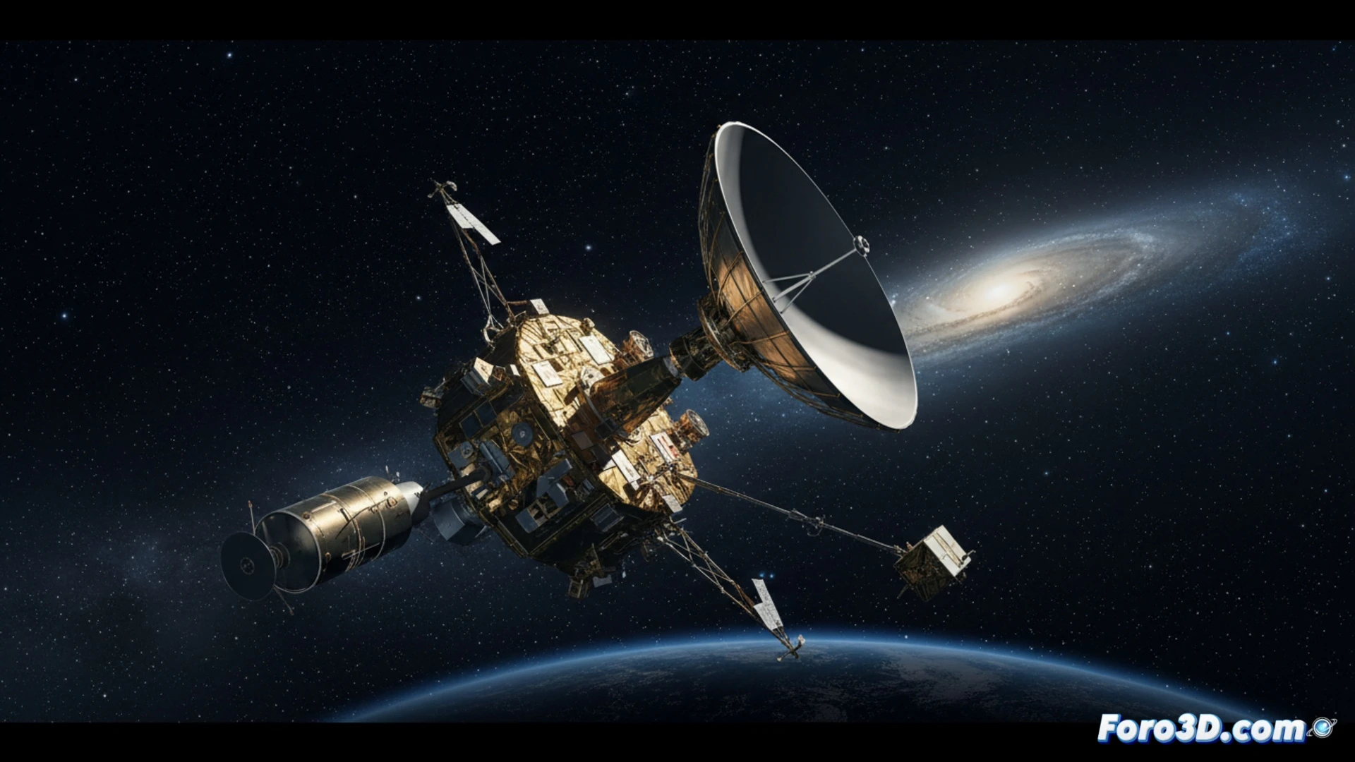
More than 25 billion kilometers from home, the Voyager 1 probe executes its last major maneuver: a programmed and elegant shutdown. To conserve the energy of its decaying nuclear generator, NASA has begun deactivating its scientific instruments one by one. This process, far from being a defeat, is a masterpiece of extended mission engineering. In the field of scientific visualization, this event offers a unique opportunity to transform telemetry data and abstract concepts into comprehensible and immersive spatial narratives.
3D Modeling and Simulation: Tools for Digital Immortality 🛰️
Voyager's power management is a ballet of numbers and voltage thresholds. Here, 3D visualization becomes crucial. We could model the probe with an interactive lighting system, where each light represents an instrument, turning off according to a real schedule. An animated graph of the thermoelectric generator would show its annual power decay versus cumulative demand. Even a simulation of its interstellar trajectory, with spheres representing the range of its active instruments, would illustrate how its field of study shrinks in a controlled manner, turning technical data into a visual story.
From Data to Legacy: The Visual Narrative of the Farewell 📡
The ultimate value of this visualization exercise transcends the technical. It's about preserving the legacy of a historic mission. An interactive 3D model and a visual timeline of the shutdown not only educate but commemorate. They allow us to witness and understand the final chapter of Voyager 1, transforming its inevitable silence into a powerful tool for outreach about the limits of technology and the tenacity of human ingenuity in exploring the cosmos.
How are the final data from a space probe at interstellar distances visualized and transmitted before its definitive shutdown?
(PS: if your manta ray animation doesn't excite, you can always add documentary music from La 2)