The World Health Organization has been warning for years that environmental noise is not just a nuisance, but a silent pathogen. A recent meta-analysis published in the journal Environmental Research confirms that prolonged exposure to levels above 55 decibels increases the risk of hypertension and coronary events by up to 8%. This finding forces epidemiology to integrate acoustic maps as an essential variable in public health studies.
3D Visualization of Acoustic Hotspots and Coronary Risk 🎧
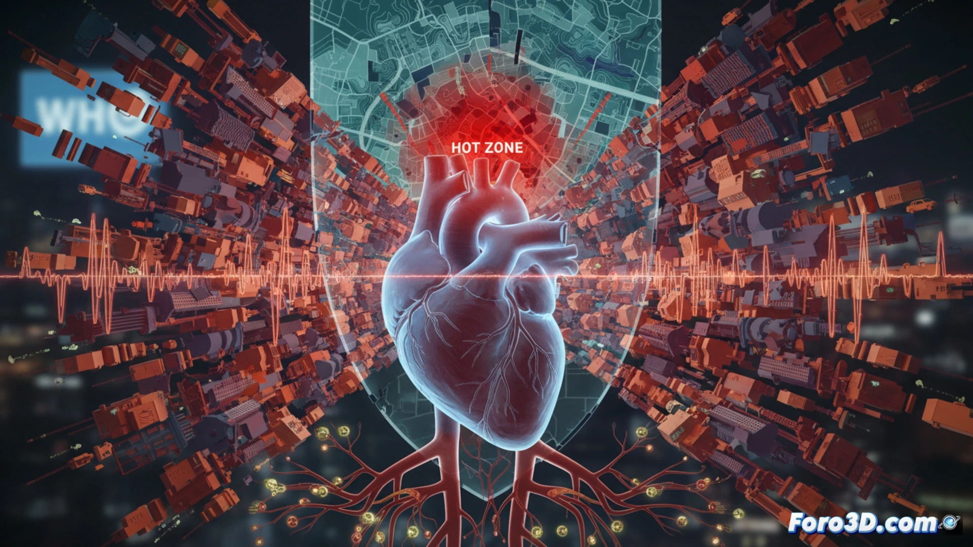
For the health data analyst, the challenge lies in cross-referencing noise and morbidity databases. Tools like QGIS or CityJSON allow generating three-dimensional models of cities where each building is tinted with a color gradient ranging from blue (quiet zones) to deep red (road corridors with heavy traffic). Overlaying hospital records of heart attacks reveals a direct spatial correlation: noise hotspots coincide with clusters of cardiovascular incidence. A predictive model based on logistic regression can anticipate future risk areas if sound sources are not mitigated.
Are We Measuring Noise as a Risk Factor? 📊
The uncomfortable question is why epidemiological surveillance systems still do not include noise as a routine variable in medical records. While we measure cholesterol and blood pressure with precision, we ignore the cumulative acoustic stress that alters the autonomic nervous system. Visualizing this data in 3D not only beautifies reports but also persuades urban planners and local governments to redesign acoustic barriers and relocate vulnerable housing. Silence, in the end, also saves lives.
How can chronic exposure to urban noise be translated into a predictive map of cardiovascular disease incidence, and which epidemiological visualization tools would be most effective for communicating this silent risk to the population and public health managers?
(PS: visualizing obesity in 3D is easy; the hard part is making it not look like a map of planets in the solar system)