HBO has released Nate and Cassie's wedding invitation as a promotion for the upcoming episode, and Euphoria fans can't stop talking about it. The design, which mixes a cursive font with the classic Copperplate Gothic, has been described as cheesy and in poor taste. The couple's image and typography capture Cassie's essence, generating divided reactions among fans.
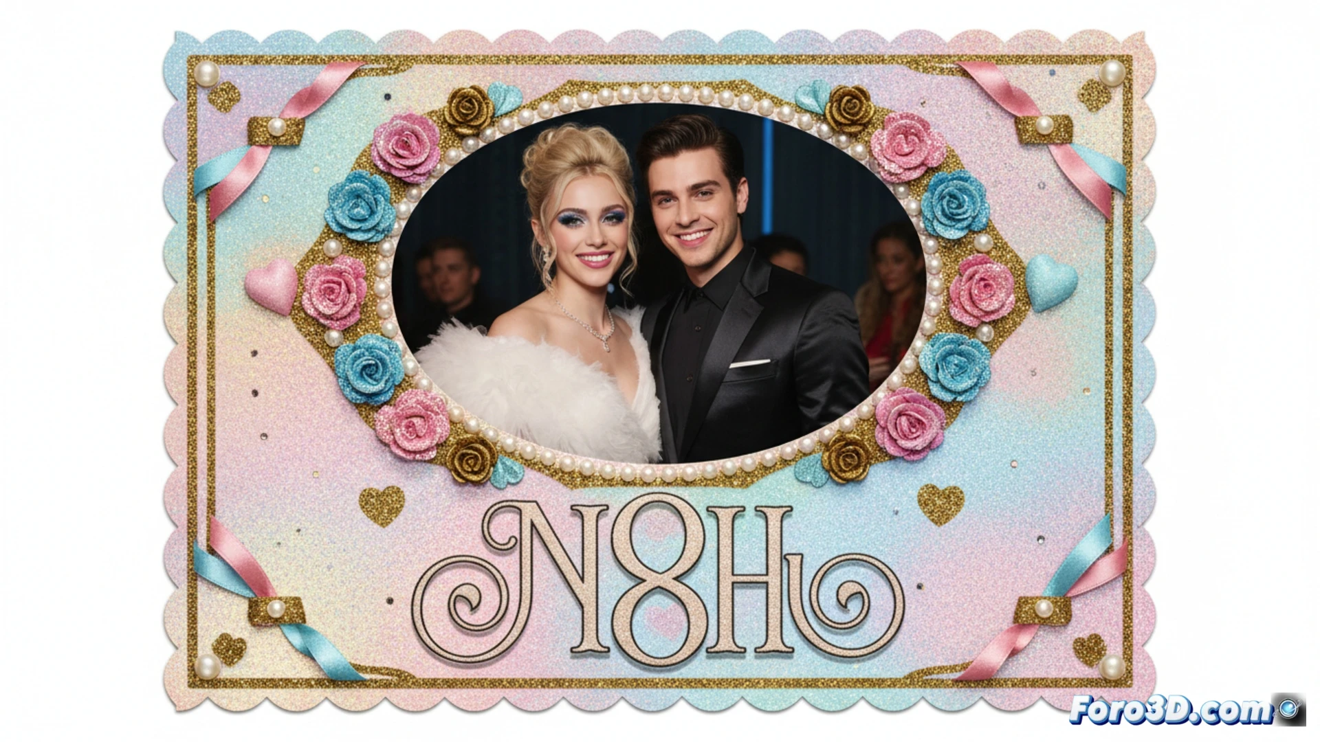
Technical analysis of the typographic design in the invitation 🎨
The typographic choice mixes two opposing styles: a decorative cursive for the names and Copperplate Gothic for formal data. This combination, common in low-budget invitations, creates a visual contrast that designers avoid due to its lack of harmony. The pastel color palette and floral frame reinforce the kitsch aesthetic. The result is a graphic artifact that looks like it came from a 90s wedding, with no intention of sophistication.
Cassie and Nate: the wedding no one asked for but everyone will watch 💍
If anyone doubted Cassie's bad taste, this invitation confirms it. It's the kind of design your great-aunt would defend on Facebook. Copperplate Gothic, that font used by banks and credit cards, now tries to sell love. The funny thing is, in Euphoria, even weddings seem like a disaster waiting to happen. At least the typography doesn't lie: this is going to be chaos.