Almost ten years have passed since NBC canceled Hannibal, and we still haven't seen a horror series that matches its technical and narrative quality. With a 93% critic score and 94% audience score on Rotten Tomatoes, Bryan Fuller's creation only managed one Emmy nomination. A snub that hurts more than a scalpel cut.
Fuller's visual cuisine: shots, color, and sound 🎨
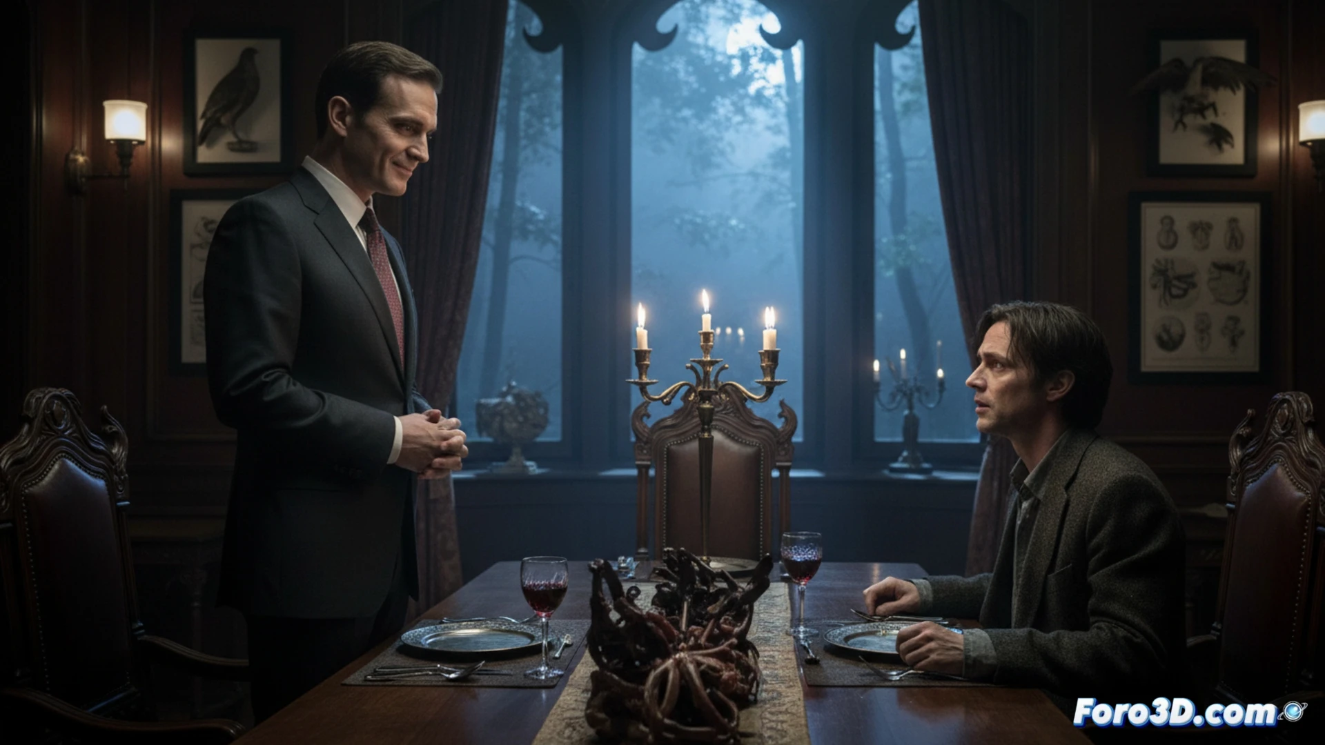
The series used a color palette dominated by red, black, and white to reflect the duality between civilization and the beast. Symmetrical framing and compositions inspired by contemporary art created constant tension. The sound editing, with strategic silences and subtle distortions, amplified the feeling that something was wrong. Every kitchen scene was a tribute to giallo and David Cronenberg's cinema, without the need for cheap digital effects.
What happens when the FBI hires a psychopathic chef 🔪
Will Graham has the misfortune of being an empath with peripheral vision problems: he doesn't see that his favorite psychiatrist is serving him sausage made from his colleagues. Meanwhile, the viewer wonders if the real crime was canceling the series early or that no one told Hannibal that a good red wine doesn't pair with raw federal agent.