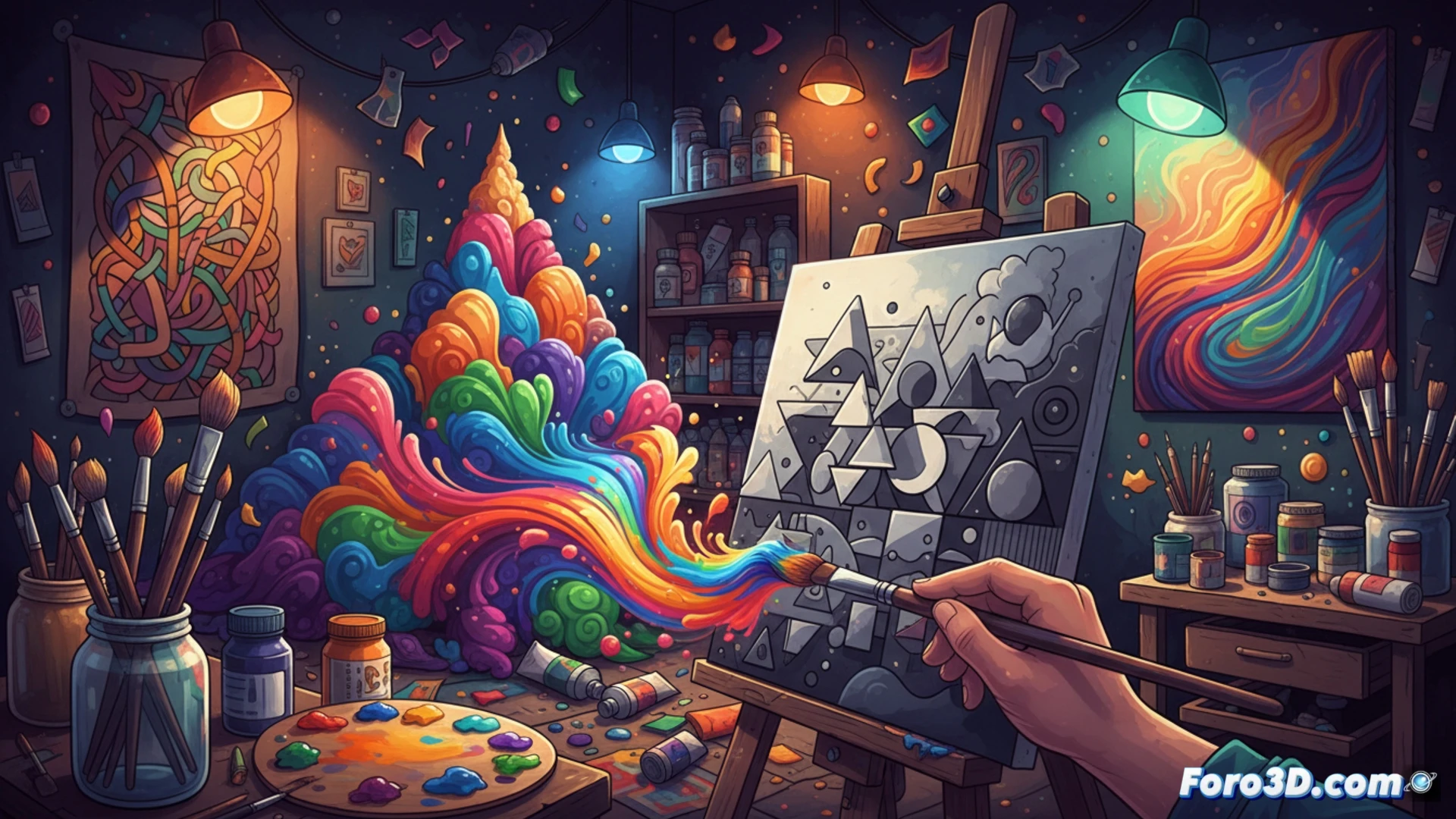
Color is not an ornament, but a structural pillar in any work. If values are the solid foundation of a composition, color acts as the seasoning that defines the atmosphere and guides the viewer's gaze. For beginners, the color wheel may seem like a labyrinth, but mastering its basic principles allows you to play with contrast and visual rhythm without fear of error. When form and value are well resolved, color becomes a field of experimentation rather than a source of anxiety.
Color management in 3D pipelines and real-time engines 🎨
In asset development for video games or architectural visualization, color is managed through linear spaces and LUTs. Working in sRGB or Rec.709 affects the final perception of the render, and a poor gamma adjustment can ruin a scene's contrast. Tools like Substance Painter or Blender allow assigning physically based color maps, where reflectance and roughness alter perceived saturation. Dynamic lighting demands chromatic consistency: a warm skybox dictates the shadows, and a white balance error distorts a model's texture.
How not to go crazy choosing between 50 shades of bluish gray 😅
If you've ever spent twenty minutes deciding whether a pixel is sky blue or ash blue, welcome to the club. Color theory promises harmony, but in practice you end up adjusting the hue with the eyedropper while your coffee gets cold. The funny thing is that, after so much deliberation, the client asks you to put it in grayscale. In the end, the secret is to accept that color is like mayonnaise: a little more or a little less doesn't ruin the dish, but overdoing saturation can cause visual indigestion.